9 Disc Golf Course Branding Ideas

A course can have great terrain, smart hole design, and a loyal local crowd, yet still feel forgettable the moment a player steps onto the first tee. That usually comes down to presentation. Strong disc golf course branding ideas are not about making a course look flashy. They are about creating a clear identity that players remember, sponsors want to support, and municipalities feel confident investing in.
For public parks, private facilities, clubs, and course committees, branding often starts with the same question: how do we make the course look organized, professional, and worth supporting without overcomplicating the project? The best answer is usually not one big dramatic feature. It is a coordinated system of visual decisions that works from the parking area to the final basket.
Why branding matters on a disc golf course
Branding affects more than appearance. It shapes how players understand the course, how guests talk about it afterward, and how stakeholders judge the quality of the facility.
When signage is inconsistent, faded, or pieced together over several years, the course can feel temporary even if the layout is excellent. On the other hand, when tee signs, welcome boards, and directional elements share a consistent look, the course immediately feels more established. That matters for city recreation departments, park boards, tournament directors, and volunteer groups trying to justify upgrades.
It also matters for player flow. Good branding creates familiarity. If every sign uses the same colors, icon style, layout logic, and terminology, players spend less time guessing and more time enjoying the round. That is not just a design win. It is an operational improvement.
Disc golf course branding ideas that actually improve the course
The strongest disc golf course branding ideas do two jobs at once. They make the course look better, and they make it easier to use.
1. Start with a defined visual identity
Many courses skip this step and go straight to ordering signs. That often leads to a mixed result where each sign solves a small problem but the overall course still looks disconnected.
A defined visual identity usually includes a course name treatment, a small set of brand colors, one or two typefaces, and a consistent graphic style. If your course already has a logo, that is a useful starting point. If it does not, even a simple wordmark and color system can create structure.
The trade-off is that custom design takes more thought up front. But it prevents the more expensive problem of replacing mismatched signs later.
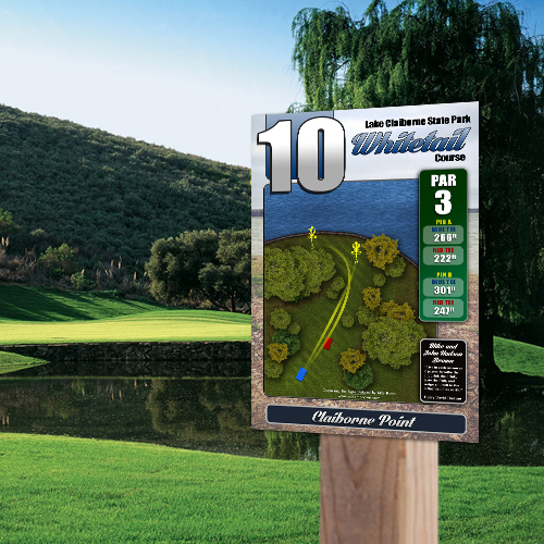
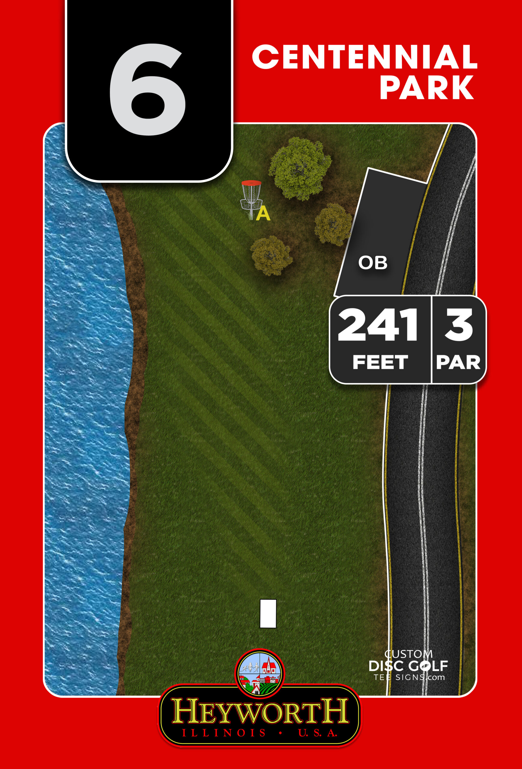
2. Make tee signs the anchor of the brand
Tee signs are where branding becomes visible on every hole. They are also where poor execution gets noticed fastest.
A well-branded tee sign does more than show distance and par. It presents the course identity in a repeatable format with consistent headers, map styling, color use, and supporting information. If the hole maps are high resolution and easy to read, the brand feels more professional. If sponsor placement is built into the layout cleanly, it feels intentional rather than crowded.
This is one reason custom signage matters. Generic templates may be faster in the short term, but they rarely reflect the actual character of the course. Custom-shaped signs, cleaner map rendering, and course-specific artwork create a stronger impression because they belong to that property, not just any property.
3. Use a welcome sign to set expectations immediately
The entrance experience carries more weight than many courses realize. A strong welcome board can establish the course name, rules, sponsor recognition, map overview, and visual identity before a player ever throws a disc.
For park departments and clubs, this is also where branding supports credibility. A professionally designed course overview tells players and community partners that the facility is maintained, organized, and cared for. It can also reduce confusion by showing parking, practice areas, restrooms, and first-tee access.
If budget is limited, prioritize one high-quality welcome sign rather than several lower-quality entrance elements competing for attention.
4. Build sponsor space into the design from the beginning
One of the most practical branding decisions a course can make is to treat sponsor recognition as part of the sign system, not an afterthought.
When sponsor logos are dropped into open space wherever they fit, the signs feel cluttered. When sponsorship zones are planned into the layout from the start, the course looks more polished and the offer is easier to present to local businesses.
This matters because branding is not just visual. It can support funding. A sponsor-ready sign package gives clubs, Eagle Scout organizers, and municipalities a clearer path to offset project costs. The key is balance. Sponsor placement should be visible, but it should never compete with critical hole information.
5. Extend the look beyond the tee pad
Branding gets stronger when it repeats in useful ways throughout the course. Directional signs, next-tee indicators, OB markers, and map kiosks should feel connected to the same system.
That does not mean every sign has to be oversized or heavily designed. In fact, some of the best systems are very restrained. The win comes from consistency. Matching colors, icon styles, numbering, and materials help the course feel unified.
This is especially valuable on multi-loop layouts or wooded properties where navigation can break down. Repetition builds trust. If players recognize the sign language instantly, they move through the course with less friction.
Branding choices that fit different types of courses
Not every course needs the same visual approach. A city park course, a championship destination, and a volunteer-built community layout all have different goals.
Municipal and public park courses
Public courses usually benefit from a clean, durable, easy-to-maintain branding system. The focus should be readability, consistency, and long-term weather performance. Materials matter here. UV-protected, outdoor-rated signs on aluminum or aluminum composite panels hold their appearance longer and reduce replacement headaches.
For these projects, branding should reassure both players and administrators. It should look professional enough for a public asset, but not so stylized that wayfinding becomes secondary.
Tournament and championship courses
More competitive courses often need a stronger visual identity because they host events, attract traveling players, and generate more photos and social sharing. This is where custom shape options, premium graphics, sharper hole maps, and a more developed sponsor presentation can make sense.
The caution is not to overdesign. If a dramatic sign shape reduces readability or creates production delays, it may not be worth it. The best premium branding still serves the player first.
Club-led and community improvement projects
Volunteer-driven projects usually need branding that is ambitious but realistic. A phased approach works well here. Start with a welcome sign and a consistent tee sign package, then add supporting directional signs as funding becomes available.
This kind of planning helps multiple stakeholders stay aligned. It also makes sponsor outreach easier because the project has a clear structure instead of feeling open-ended.
Common branding mistakes to avoid
The biggest mistake is inconsistency. A nice logo cannot fix five different sign layouts, mixed terminology, and faded navigation pieces from three previous upgrades.
Another common issue is treating design and production separately. A sign may look good on a screen but fail outdoors if the material, finish, or print quality is not right for long-term exposure. Branding only works when the visual concept and the physical product support each other.
There is also the temptation to cram too much into each sign. More logos, more rules, more graphics, more text. Usually, that weakens the result. Players need clear information first. Branding gets stronger when it is disciplined.
How to turn disc golf course branding ideas into a real project
The practical path is simpler than many buyers expect. Start by identifying what the course needs most right now. That may be tee signs, a course overview, better sponsor presentation, or a full sign system refresh.
From there, gather the assets that define the course – hole data, branding references, logo files if available, sponsor needs, and any map details worth highlighting. Then look at the sign package as one coordinated project instead of a series of isolated pieces.
This is where working with a disc-golf-specific signage partner helps. A focused workflow with custom design, proofing, and material options saves time and reduces back-and-forth because the design decisions are being made by people who already understand tee sign hierarchy, hole layout readability, and sponsor integration. Custom Disc Golf Tee Signs approaches projects this way so buyers can move from concept to proof to production without having to manage every design detail internally.
A branded course does not need to be extravagant to feel professional. It needs to feel intentional. When the signage system is clear, durable, and visually consistent, the course earns a stronger first impression and a better reputation over time. If you are planning upgrades, start with the elements players use every round and build a brand system that makes the whole property easier to navigate, easier to support, and harder to forget.