Disc Golf Navigation Signs That Work
A player finishes Hole 6, looks up, and immediately knows where to go next. No wandering across fairways. No worn footpaths heading in three different directions. No first-time group standing by the basket trying to guess whether Hole 7 starts left, right, or across the road. That is what disc golf navigation signs are supposed to solve, and when they are done well, the whole course feels more organized from the first tee to the final putt.
For course managers, clubs, and parks departments, navigation signage is not a small finishing touch. It is part of the course infrastructure. It affects pace of play, safety, player satisfaction, and the overall impression your facility makes on casual players, tournament directors, sponsors, and city stakeholders. If the goal is to bring your course to a higher standard, navigation deserves the same attention as baskets, tee pads, and course maps.
Why disc golf navigation signs matter more than most courses realize
The easiest way to spot a course with weak navigation is to watch new players use it. They hesitate after holes. They backtrack. They walk into other fairways. They miss alternate tee locations. Even strong layouts can feel frustrating when transitions are unclear.
That frustration adds up quickly. A course that is hard to follow feels less welcoming, especially for beginners, families, visiting players, and event participants seeing the property for the first time. It also creates repeated questions for staff, volunteers, and local club members. If your course relies on regulars to explain where the next tee is, your signage system is doing too little.
There is also a safety angle that should not be ignored. Poor navigation can send players through active landing zones, maintenance roads, parking areas, or park spaces shared with pedestrians. Clear directional signs help move traffic where it belongs. That matters on compact properties, multi-use parks, and any course with blind transitions.
Well-designed signage also changes how the course is perceived. Consistent, professional signs signal that the course is maintained, intentional, and worth respecting. That can support sponsor conversations, justify capital improvements, and make a stronger case for municipal support.
What effective disc golf navigation signs actually need to do
A navigation sign has one primary job – move players confidently to the next decision point. That sounds simple, but many signs fail because they try to do too much, say too little, or are placed where players do not naturally look.
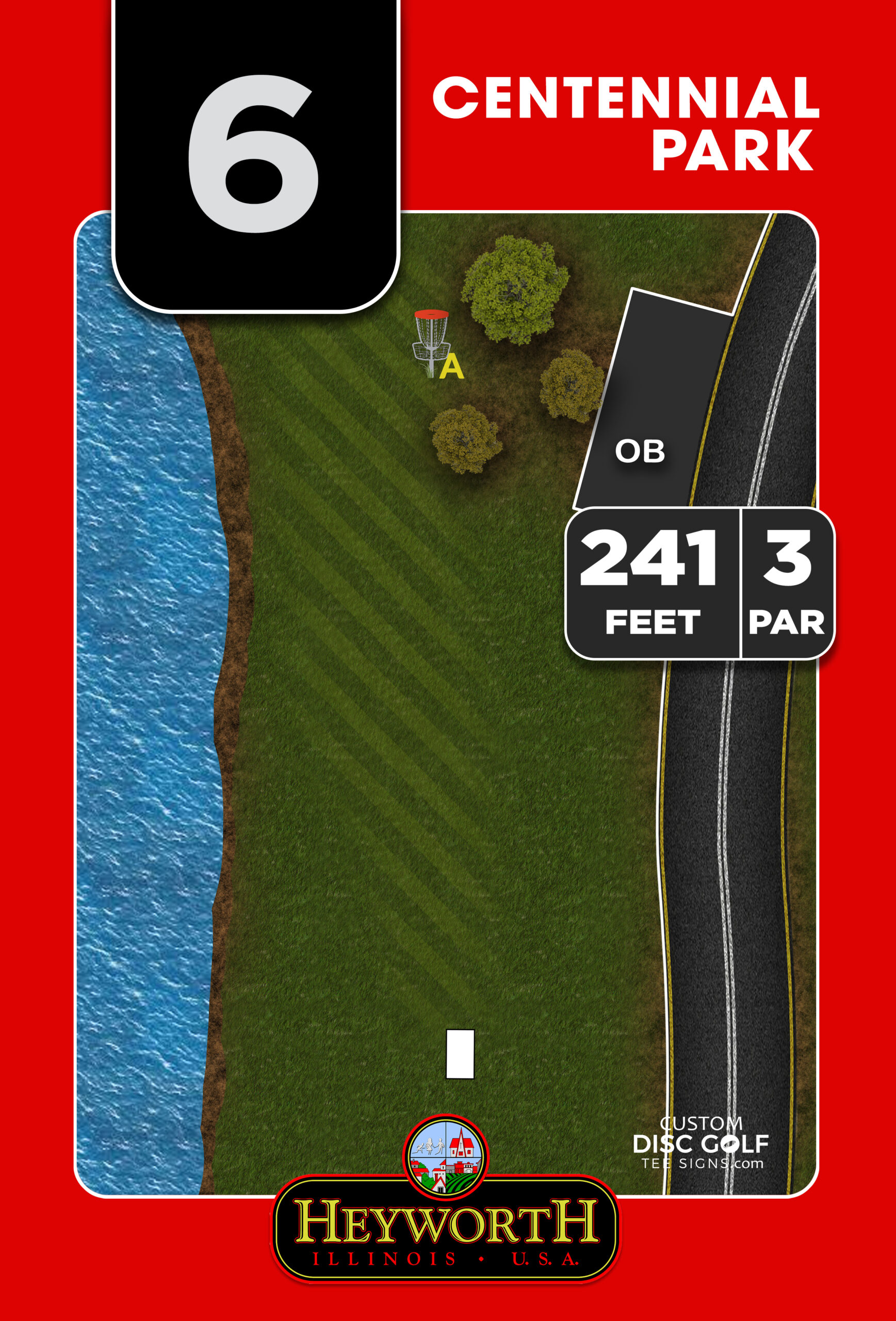
At a minimum, the sign should answer the next movement question instantly. Where is the next tee? Which direction should I walk? Is there a path, bridge, split, or crossing I need to follow? If your course has long transitions or multiple pin and tee combinations, the sign should reduce uncertainty instead of adding more information to interpret.
Clarity starts with layout. Strong arrows, readable numbering, high contrast, and clean spacing matter more than decorative elements. Fonts need to stay legible outdoors in changing light. Colors should support visibility, not compete with it. If the sign is meant to be read while walking away from a basket, that use case should drive the design.
Placement is just as important as graphics. A great-looking sign installed ten feet too far from the natural exit line can still be missed. Players should see the sign where they pause after finishing the hole, not after they have already started guessing.
Common problems with navigation signage
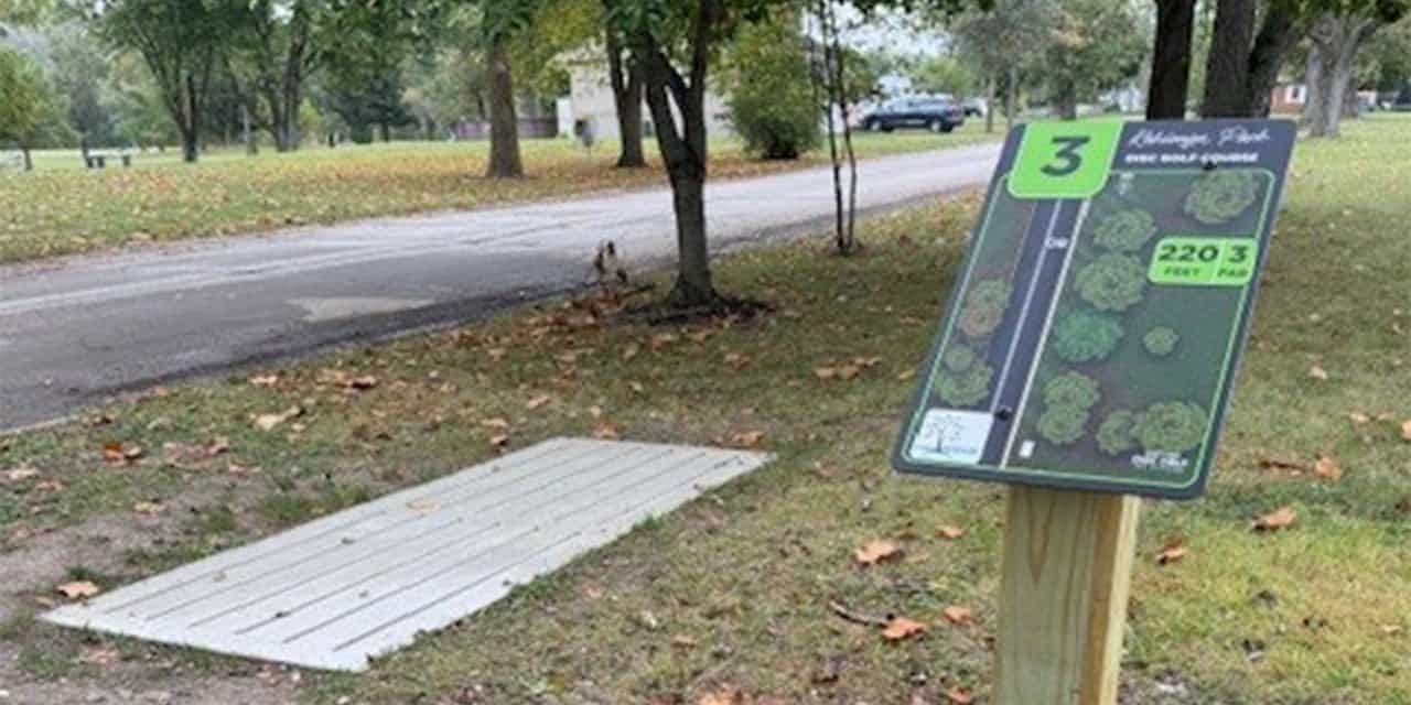
Many courses patch navigation together over time. A small arrow gets added after a few complaints. Then a laminated sheet appears near a fork in the path. Then someone paints an arrow on a stump. These fixes are understandable, especially on volunteer-led projects, but they usually create inconsistency rather than a system.
One common problem is mismatch. Tee signs may be professionally done while directional signs look temporary, use different numbering, or rely on different colors and graphics. Another is undersizing. Signs that are too small disappear into the landscape, especially in wooded settings or busy park environments.
Durability is another frequent issue. Paper inserts, low-grade print methods, and non-protected surfaces fade fast under UV exposure and weather. Once a sign becomes hard to read, players stop trusting it. That is a bigger problem than having no sign at all, because bad signage creates false confidence.
There is also the issue of underplanning. Courses often think about navigation only after installation, when the real need is during the broader sign system design. The best results come from looking at tee signs, course overviews, maps, and directional signage as one coordinated package.
Designing for the property, not a generic template
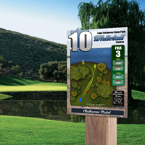
Every course moves differently. A wooded 18-hole course with tight transitions has different needs than a long open championship layout, a mixed-use city park, or a beginner-friendly community course. That is why generic sign templates usually fall short.
Navigation signs should reflect the actual player journey on your property. Some courses need simple next-tee arrows after each basket. Others need larger signs at trail intersections, parking lot crossings, or multi-path areas where players can easily drift off course. A few need confirmation markers halfway through a long walk so players know they are still headed the right direction.
This is where custom design makes a real difference. Course-specific artwork, consistent numbering, coordinated branding, and signage sized for actual sightlines produce a better result than adapting a one-size-fits-all format. It also helps when the same design team understands disc golf course flow, not just signage production in general.
For organizations balancing aesthetics and function, that custom approach also keeps the course looking professional. Navigation signs do not need to feel like an afterthought. They can match your tee signs, support sponsorship placement where appropriate, and reinforce the identity of the course without sacrificing readability.
Materials and construction affect long-term value
If your course is outdoors year-round, the sign system needs to be built for that reality. Moisture, sunlight, temperature swings, mower impact, and routine wear all take a toll. Navigation signs may seem smaller or simpler than tee signs, but they still need durable materials and print protection.
Aluminum composite and aluminum are popular choices for a reason. They hold color well, resist weather, and present a cleaner, more permanent appearance than temporary substrates. UV protection is especially important because fading is often what makes signs fail first. A directional sign with weak contrast after a season or two stops doing its job.
There is always a budget conversation here, and fairly so. Not every course needs premium-shaped signs at every transition point. But going too cheap on material can create replacement costs, inconsistent appearance, and more labor later. For many buyers, the right move is to prioritize durable construction on signs that serve high-traffic or high-confusion areas, then build out the rest of the system with the same visual standards.
Sponsorship can help fund better navigation
Course upgrades often stall because navigation is seen as necessary but not exciting enough to fund on its own. Sponsorship changes that equation. If signage is designed with sponsor support in mind from the start, directional and tee sign projects become easier to justify.
The key is to do it professionally. Sponsor placement should never overpower the directional function of the sign, but it can be integrated cleanly into a coordinated sign package. For clubs, municipalities, and Eagle Scout coordinators trying to stretch budgets, that structure can offset costs without making the course feel cluttered.
It also helps during stakeholder approvals. A signage system that improves navigation, upgrades course appearance, and creates sponsor opportunity is easier to present than a collection of one-off signs with no clear long-term plan.
A better process leads to a better result
The strongest sign projects do not start with printing. They start with a clear review of the course, decision points, sign types, and design hierarchy. Where do players get lost now? Which transitions cause backups or safety concerns? What signs need arrows only, and which need map support? How should everything look together once installed?
A structured proofing process matters because multiple stakeholders are usually involved. Clubs, parks staff, city departments, donors, and sponsors may all need input. A disciplined workflow keeps the project moving while still giving decision-makers confidence that the final signs will be accurate and course-specific.
That is one reason specialized providers tend to outperform general sign shops on these projects. This is not just about printing panels. It is about understanding how players read a course, how hole-to-hole flow works, and how to build a sign system that supports the way disc golf is actually played. Custom Disc Golf Tee Signs focuses on that niche, which helps organizations move faster and avoid the trial-and-error approach that costs time later.
When should a course upgrade its navigation signs?
Usually sooner than it thinks. If players regularly ask where to go next, if temporary arrows have become permanent, if signs no longer match the current layout, or if your course is preparing for a tournament or public relaunch, the need is already there.
The same goes for courses that have improved baskets, pads, or branding but left navigation behind. Players notice the gap right away. A course can have excellent equipment and still feel unfinished when movement between holes is confusing.
The good news is that navigation upgrades do not have to be complicated when they are approached as a coordinated system. With the right design, materials, and planning, these signs do more than point players forward. They help the entire course operate better, look better, and feel ready for the level of play you want to support.
If you want your course to feel more professional the moment a player steps on site, start with the places where confusion begins and fix them with signs built to last.