Disc Golf Hole Layout Signs That Work
A player steps onto the tee, studies the fairway, and still has one question – where is the basket, and what is this hole asking them to do? That moment is exactly why disc golf hole layout signs matter. A well-designed sign does more than label a tee pad. It gives players confidence, reduces hesitation, improves flow, and presents your course as a place that is cared for and built to a higher standard.
For course owners, clubs, parks departments, and volunteer organizers, signage is often treated as a finishing touch. In practice, it shapes the entire round. When the sign is clear, durable, and course-specific, players move with less confusion and more trust in the layout. When the sign is generic, faded, or missing key details, the course feels harder to navigate and less polished, even if the holes themselves are strong.
What good disc golf hole layout signs actually do
The best signs are not decorative extras. They are operational tools. They help first-time visitors understand the hole quickly, and they help returning players confirm distance, landing zones, mandatories, out-of-bounds, and basket position without second-guessing.
That matters for public parks as much as tournament venues. Casual players want a smoother round. League directors want fewer delays. Park staff want fewer complaints about confusing layouts. In every case, the sign supports the user experience and reduces friction on the course.
A strong layout sign also reinforces course identity. Matching colors, logo placement, numbering, and map style create a more professional look from hole one through eighteen. If your course has invested in baskets, pads, and maintenance, the signage should reflect that same level of care.
Why layout clarity matters more than adding more information
One common mistake with disc golf hole layout signs is trying to fit everything onto the panel. More details do not always create a better sign. If the player has to stand at the tee sorting through cluttered visuals, the sign is not doing its job.
The priority is readable hole information at a glance. Players should be able to identify the tee location, fairway shape, basket position, distance, and major obstacles in seconds. Extras like par, sponsor placement, park branding, alternate pin information, and directional guidance can absolutely add value, but only if they are organized cleanly.
This is where custom design makes a real difference. A wooded technical course, an open park course, and a championship property all need different visual emphasis. Tight tunnel holes may require more map precision. Multi-pin layouts may need a clear method for distinguishing basket positions. Courses with water carries or safety-sensitive crossings need hazard information that is obvious, not buried.
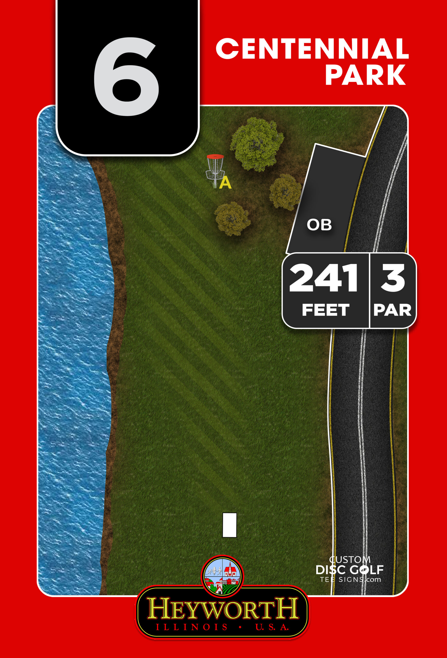
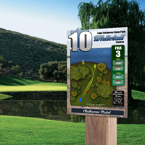
The most useful elements on disc golf hole layout signs
The right sign balances simplicity with the right amount of detail. In most cases, the most useful signs include a high-resolution hole map, accurate distance, hole number, par, next tee direction, and clear marking of major features such as trees, water, OB, and mandatories.
Beyond that, it depends on the course. Municipal parks may want local branding and rules messaging. Clubs often want sponsor space to help offset project costs. Tournament-focused courses may need long and short tee references, pin placements, or cleaner competitive data presentation.
The key is designing for real use on the tee pad, not designing for a proof that looks busy and impressive on a screen. A sign should be readable outdoors, in changing light, by players who are standing a few feet away and making a quick decision.
Map accuracy is not optional
Players notice when the sign does not match the hole. If the basket is shown in the wrong location, the fairway shape is oversimplified, or the landing area is misleading, trust drops immediately. That does not just affect one hole. It changes how players view the entire course setup.
Accurate layouts are especially important on courses with elevation change, doglegs, blind baskets, split fairways, or multiple sleeves. In those situations, the sign is doing real navigational work. It should help players see the intended route and understand the challenge before they throw.
Durability affects perception and maintenance costs
A great design printed on the wrong material does not stay great for long. Outdoor signs need to handle sun, rain, temperature swings, and routine wear. UV protection, proper substrates, and solid mounting all matter.
For clubs and municipalities, this is not just about appearance. It is about replacement cycles and labor. Cheap signs tend to fade, peel, or warp faster, which means more maintenance and another round of approvals and spending sooner than expected. Durable materials give you a cleaner course presentation and a better long-term return.
Custom signs vs. generic templates
Template-based signs can seem like a shortcut, especially when a course is trying to move quickly. Sometimes they are enough for a temporary need or a very basic navigation upgrade. But they usually show their limits fast.
Most courses are not built from simple, repeated hole shapes. They have unique fairways, local branding, sponsor needs, and specific player traffic concerns. A generic layout style often struggles to present those details clearly. The result is signage that looks passable from a distance but does not fully support the course.
Custom disc golf hole layout signs allow the layout, typography, branding, and sponsor placement to fit the hole and the facility instead of forcing the course into a one-size-fits-all format. That is particularly valuable for parks improving course image, clubs building sponsor programs, and organizations trying to create a more complete destination experience.
Sponsorship space can make the project easier to fund
For many courses, budget is the biggest obstacle to replacing outdated signs. That is why sponsor integration matters. Well-designed sponsor placement can help offset project costs without overwhelming the hole information.
The balance is important. Sponsors should be visible and professional, but the sign still needs to serve players first. When sponsorship is built into the layout properly, it supports both goals. Courses gain a cleaner funding path, and local businesses get placement on a visible community asset.
This is especially helpful for club-led improvements, Eagle Scout projects, and community-supported upgrades where funding may come from several small sources instead of a single capital budget.
A better workflow leads to better signs
Signage projects tend to stall when nobody owns the process. Hole data is incomplete, artwork is inconsistent, approvals drag on, and the course ends up delaying installation for months. That is why a structured design and proofing workflow matters as much as the sign itself.
A good process starts with accurate course information, clear photo or map references, and decisions about branding, materials, and sponsor inclusion. From there, proofing should be straightforward. Stakeholders need to review real layouts, confirm details, and move efficiently toward production.
For parks departments and clubs, this reduces back-and-forth and makes it easier to get multiple decision-makers aligned. It also prevents a common problem – ordering signs before the layout details are fully confirmed.
When it pays to upgrade the whole signage system
Sometimes replacing a few damaged tee signs is enough. Other times, partial fixes only make the inconsistencies more obvious. If the course map, tee signs, directional signs, and branding all look unrelated, the player experience still feels fragmented.
That is why many organizations benefit from thinking beyond individual tee panels. A coordinated system that includes course overview signage, hole layouts, and wayfinding creates a more complete result. It helps new players navigate, supports event-day flow, and makes the facility look intentionally designed rather than patched together over time.
For courses trying to attract more traffic, host events, or strengthen community support, that visual consistency matters. It sends a clear message that the course is established, maintained, and worth returning to.
Choosing signs that fit your course now and later
Not every course needs the same level of sign package. A small local course may need practical, durable navigation first. A high-traffic park may need stronger branding and sponsorship support. A championship-caliber property may want premium materials, custom shapes, and advanced layout detail.
The right choice depends on budget, course goals, and how long you want the system to serve before the next upgrade. What matters most is choosing signage that fits the actual demands of the course instead of buying to the lowest initial cost.
When disc golf hole layout signs are designed well, they solve multiple problems at once. They improve navigation, support pace of play, strengthen course identity, and reduce the frustration that comes from unclear or outdated information. That is why signage is rarely just a print project. It is course infrastructure.
If your course is ready to look more polished and play more clearly, better signage is one of the fastest ways to make that change visible on day one.