What Information Goes on Tee Signs?
A player steps onto the tee pad, looks up, and should know exactly what comes next. If they have to guess where the basket sits, which mando applies, or whether they are throwing 280 feet or 420, the sign is not doing its job. When course leaders ask what information goes on tee signs, the real answer is this: enough to make play intuitive, safe, and professional without crowding the panel.
For clubs, parks departments, and course managers, tee signs are not just markers. They are part of the player experience, part of course branding, and often part of the funding strategy when sponsors are included. The best signs balance clarity, durability, and layout discipline. They give players what they need at a glance and still look sharp years after installation.
What Information Goes on Tee Signs First
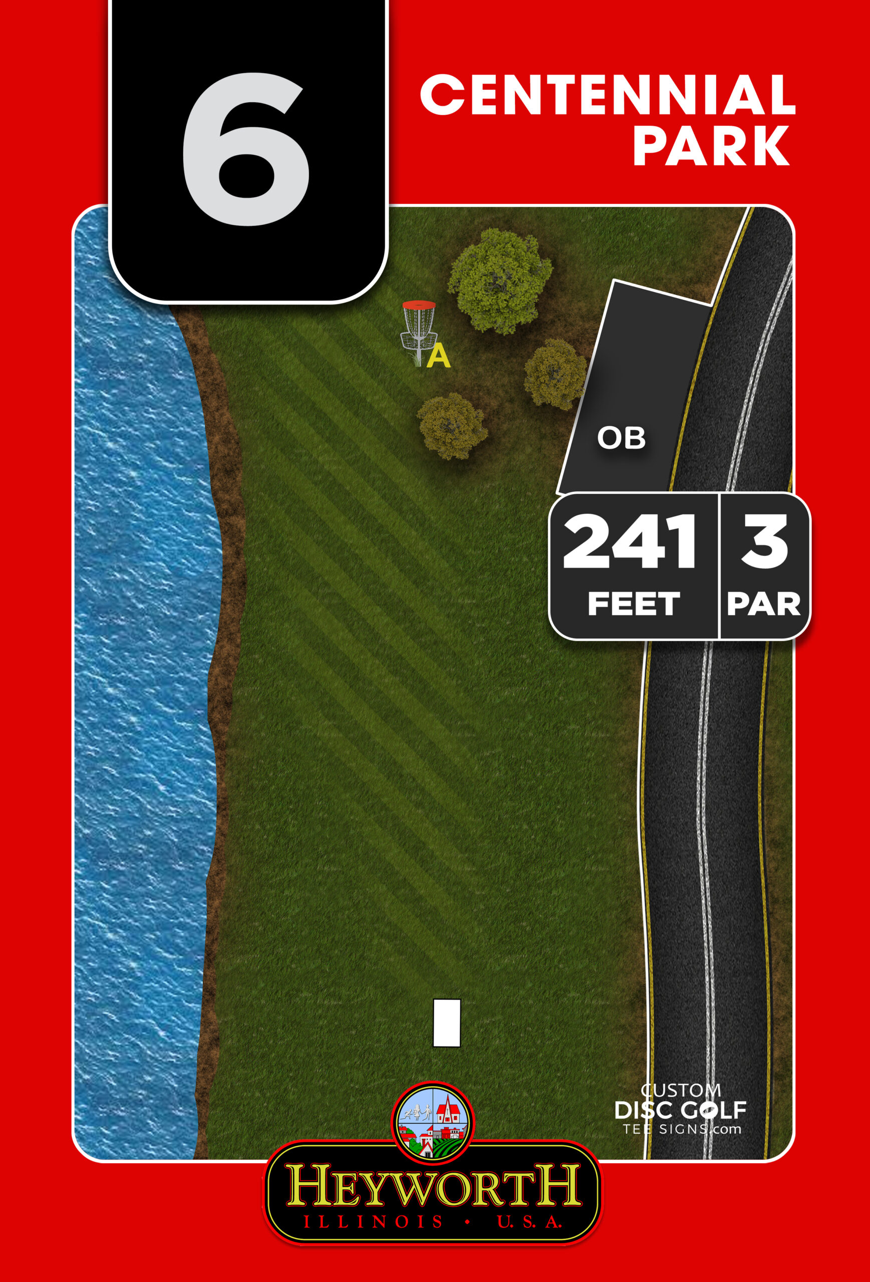
The most important content is the information a player uses before the throw. That starts with the hole number, par, and distance. These are the core details players expect immediately, and they should be the easiest elements to find on the sign.
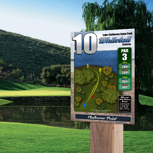
The hole number needs to be prominent because it supports flow and navigation across the course. Par should be visible but secondary to the hole number. Distance should be accurate and clearly labeled, especially if the course includes multiple pin positions or alternate tees. If there are long and short layouts, the sign should show each distance in a way that is easy to understand at a glance.
Right after those basics, the hole map becomes the most valuable piece of information on the sign. A clean overhead layout helps players read the fairway, understand the landing zones, and see where trouble begins. A strong map can reduce backups, limit confusion for first-time visitors, and improve pace of play because players make decisions faster.
The Essential Tee Sign Elements
A well-designed tee sign usually includes six core elements: hole number, par, distance, basket location, tee location, and the fairway map. If any of these are missing, the sign starts to lose practical value.
The tee location and throwing direction should be unmistakable. On some courses, especially wooded or multi-use properties, players can stand on the pad and still feel uncertain about where the hole begins. A directional map solves that quickly. The basket location matters just as much, particularly on holes with blind finishes or elevation shifts.
If the course has multiple basket placements, that should be reflected visually and with labels. The same goes for multiple tee pads. One sign can serve several layouts, but only if the information hierarchy is organized well. If the panel becomes cluttered, the sign creates more confusion instead of less.
What Information Goes on Tee Signs for Better Navigation
Navigation information is where many courses fall short. Good tee signs do more than explain the current hole. They help players move through the entire property with confidence.
An arrow to the next tee is one of the most useful additions you can include, especially on courses where the walking path is not obvious. This is a small detail that saves players time and reduces frustration. It also helps protect landscaping and natural areas because visitors are less likely to wander off the intended route.
Some courses also benefit from including nearby landmarks, creek crossings, out-of-bounds roads, or paths shared with pedestrians. This depends on the property. A simple park course may not need much more than the hole map, while a larger championship layout often needs more guidance built into each sign.
The trade-off is space. Every extra navigation cue needs to earn its place. If the sign tries to show too much, players stop reading it. Strong tee sign design is not about cramming in every possible detail. It is about showing the right detail in the clearest format.
Hazard, OB, and Rule Information
If a player can lose a stroke because of a course rule, the sign should help make that rule visible. This is especially true for out-of-bounds lines, mandatory routes, drop zones, water carries, and safety-related restrictions.
On technical or tournament-ready courses, marked OB and mandatories are often essential. A sign that clearly identifies these elements supports fair play and reduces disputes. If there is a mando tree, directional gate, or protected area, it should be indicated directly on the map and reinforced with a short label.
That said, not every local rule belongs on the tee sign. A full paragraph of text is rarely effective. If your course has complex event-only rules, those are usually better handled through scorecards, caddie books, or temporary tournament materials. Tee signs should focus on permanent, high-value information that applies to regular play.
Branding and Course Identity
Tee signs also represent the course itself. A consistent design system tells players the course is cared for, organized, and built to a higher standard. That matters whether the course is in a city park, a private facility, a church property, or a state park.
Branding can include the course logo, park identity, color coding, and visual style that matches the rest of the signage package. This is not decoration for its own sake. It helps create consistency across tee signs, course maps, and directional signs, which makes the entire property easier to use.
For public facilities and municipalities, branding also supports legitimacy. It presents the course as a permanent recreational asset rather than an informal layout with temporary markers. That perception can matter when departments are justifying investments, planning upgrades, or presenting improvements to boards and community stakeholders.
Sponsor Placement Without Hurting Readability
Sponsor integration is one of the smartest ways to offset project costs, but it needs to be handled professionally. A sponsor block should feel intentional, not pasted into the only open corner.
The best approach is to reserve a dedicated sponsor area within the sign layout. That space should be visible enough to provide value to the sponsor without competing with hole information. When sponsor logos overpower the map or crowd the distance and par, the sign stops serving players first.
For clubs and volunteer-led projects, this matters a lot. Sponsors are often what make a full tee sign package possible. With the right design workflow, sponsor space becomes an asset instead of a compromise. It can support fundraising while still preserving a polished look across the entire course.
Material and Layout Affect the Information You Can Use
What goes on a tee sign is not only a content decision. It is also a production decision. The amount of detail you can include depends on the sign size, print quality, material, and viewing distance.
A larger panel allows room for a more detailed hole map, multiple pin positions, and sponsor placement without sacrificing readability. A smaller sign may require a tighter, more selective layout. High-resolution artwork is important because thin fairway lines, small labels, and elevation indicators need to stay sharp once printed.
Material matters too. Durable UV-protected signs on aluminum composite or aluminum help preserve color and legibility over time. If the sign fades, scratches easily, or warps, even good information becomes hard to use. That is why sign design and sign production should not be treated as separate conversations.
Matching the Sign to the Course Type
A short beginner-friendly course does not need the same tee sign content as a championship layout. That is where customization matters.
For a recreational nine-hole course, the ideal sign may be simple: hole number, par, distance, clean map, and next tee direction. For a longer and more technical course, players may need alternate basket positions, OB markings, mando indicators, sponsor space, and a more detailed fairway drawing. Neither approach is better in every case. The right sign is the one that matches the course and the audience using it.
This is also why generic templates often fall short. Disc golf courses vary too much in terrain, layout complexity, and stakeholder goals. A good signage package should reflect the actual course instead of forcing the course into a one-size-fits-all sign.
A Simple Standard for Great Tee Signs
If you are deciding what information goes on tee signs, use one practical test: can a first-time player stand on the pad, look at the sign for a few seconds, and confidently understand the hole? If the answer is yes, the sign is doing real work.
That usually means the panel shows the hole number clearly, gives accurate distance and par, maps the fairway in a readable way, identifies permanent hazards or mandatory routes, and leaves room for course branding or sponsorship without clutter. At Custom Disc Golf Tee Signs, that balance is where strong design earns its value.
When a tee sign is planned well, it does more than label a hole. It helps your course play better, look better, and feel like a finished facility that players remember for the right reasons.