How to Design a Disc Golf Course Map
A course map usually gets judged in about five seconds. Players walk up, glance at it, and decide whether your course feels organized or confusing. That is why knowing how to design a disc golf course map matters so much. A strong map does more than show where Hole 1 starts. It sets expectations, improves flow, reduces wrong turns, and gives your course a more professional presentation from the first look.
For clubs, park departments, and course managers, a map is also a working tool. It helps new players navigate without needing a local guide, gives tournament visitors confidence, and creates a clean place to recognize sponsors. If the course overview is cluttered, inaccurate, or missing key details, the player experience suffers before anyone throws a disc.
Start with the job the map needs to do
Before you choose colors, icons, or materials, define the purpose of the map. Some courses need a simple kiosk overview that gets players from hole to hole. Others need a more detailed map that supports event traffic, multiple tees, alternate pin placements, parking, restrooms, and safety notes. The right design depends on who uses the course and how complex the layout is.
A beginner-friendly 9-hole course in a community park can usually stay simple. A wooded 18-hole course with long walks, crossing fairways, and tournament traffic needs more structure. If your map tries to show every possible detail without hierarchy, it becomes harder to read. If it shows too little, players miss important navigation cues. Good design is not about adding everything. It is about deciding what belongs first.
How to design a disc golf course map with accurate source material
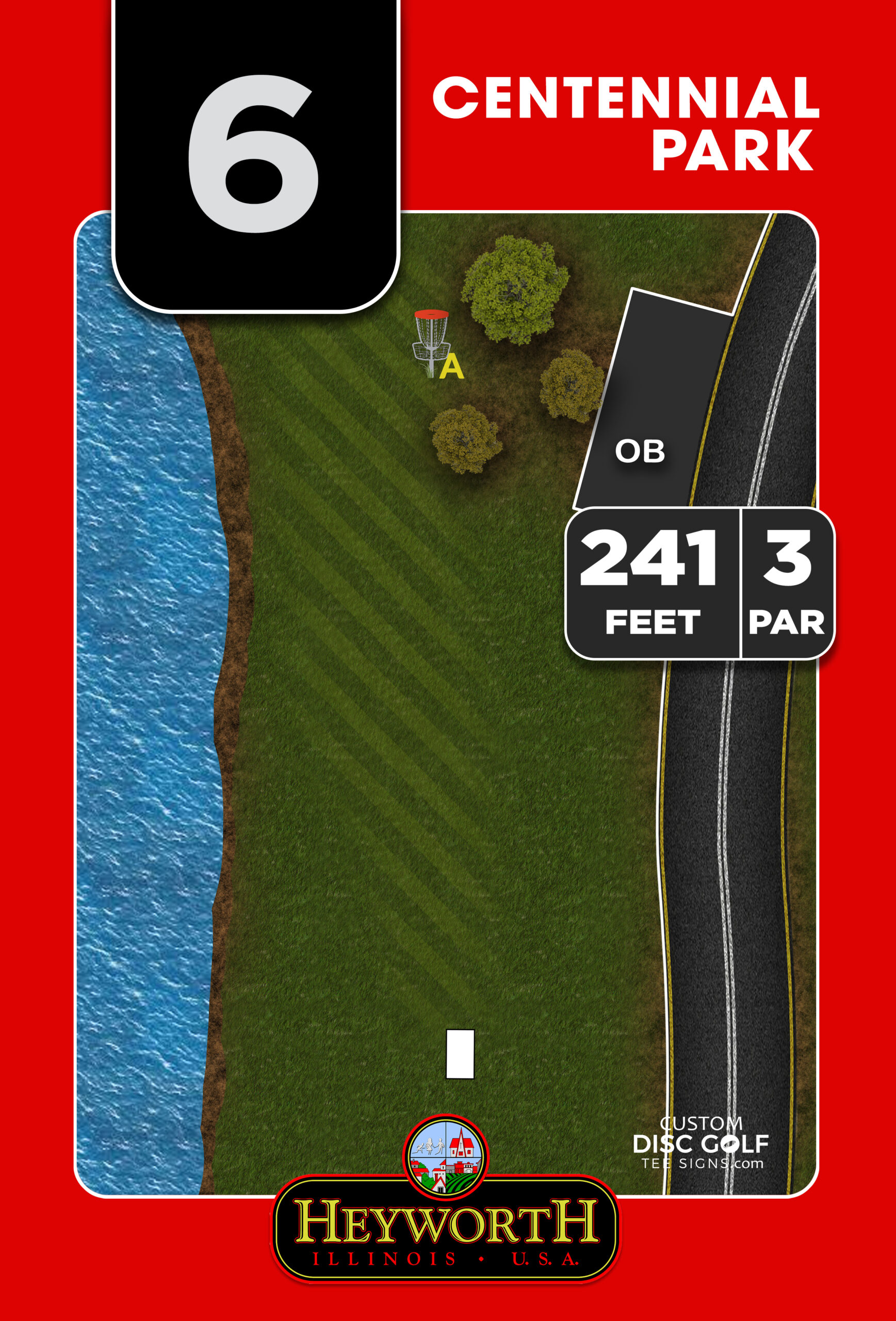
The biggest mistake in course map design is building from bad information. If your distances, basket placements, walking paths, or tee positions are off, the final product looks polished but still fails in the field. Start by gathering the most current layout details from the people who know the course best.
That usually means confirming each hole number, par, tee location, basket location, and the intended path to the next tee. If your course has short and long tees, temporary tournament layouts, or multiple basket sleeves, decide early whether the map will show all options or focus on the permanent public layout. There is no universal answer here. A public-facing kiosk map should usually prioritize everyday play, while a tournament board may need more detail.
If possible, work from a combination of site photos, satellite reference, existing layout sketches, and on-the-ground review. Even a professionally designed sign package works best when the source information has been verified by someone physically familiar with the property.
Mark the features beyond the holes
A good course map is not just a chain of tee pads and baskets. Players also need context. Parking lots, practice baskets, pavilions, restrooms, walking trails, water hazards, road crossings, and out-of-bounds areas often deserve a place on the map. So do entry points and any spots where non-players commonly cross the course.
This is especially important on municipal and multi-use properties. A map that clearly shows shared paths and park infrastructure helps both navigation and safety. It can also reduce wear on sensitive areas by guiding foot traffic where you want it to go.
Build the map around readability first
When people ask how to design a disc golf course map, they often focus on artwork. Artwork matters, but readability matters more. If the player cannot instantly tell where they are, where they are going, and how the course flows, the map is not doing its job.
Start with orientation. The map should make sense from the player’s viewpoint at the kiosk or first tee whenever possible. Include a clear “You Are Here” marker if the map is installed at a course entrance or central information board. North arrows can help, but the real priority is intuitive layout.
Use contrast carefully. Fairways, rough, woods, water, paths, and roads should be visually distinct without competing for attention. Hole numbers need to stand out. Walking routes between holes should be visible but secondary to the hole layout itself. If every line weight and every color carries the same visual force, nothing stands out.
Text is another common trouble spot. Small type may look clean on a screen but become difficult to read outdoors, especially in bright light. Keep labels short, use legible fonts, and avoid forcing too much copy into the sign face. A course map is not the place for long explanations.
Use color with discipline
Color can organize a map quickly, but only if it is used consistently. One color for fairways, another for water, another for walking paths, and another for park features is often enough. If you assign a different color to every hole, sponsor block, and terrain type, the map gets busy fast.
It also helps to think about print performance. Outdoor signs need color choices that hold up well in sunlight and remain readable after long-term exposure. High-contrast, professionally prepared artwork generally performs better than overly subtle palettes or low-contrast gradients.
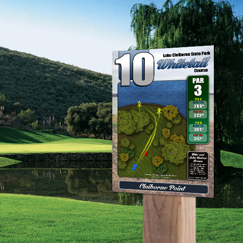
Decide what level of detail belongs on the overview map
Not every piece of information belongs on the course overview. This is where many projects get stuck. Stakeholders want the map to do everything at once, but the better approach is to let the overview map handle the big picture and let tee signs handle hole-specific detail.
A course map should usually show the full routing of the course, key park features, directional flow, and major amenities or hazards. It may also include a course legend, general rules, and sponsor placement if space allows. What it should not do is replace the individual hole sign.
That division of labor matters. When the overview map tries to include every tree line, basket angle, distance option, and elevation note for every hole, the whole sign becomes crowded. Players benefit more from a clean course map paired with high-quality tee signs that provide detailed hole layouts where those details are needed.
Make room for branding and sponsorship without hurting function
For many public and club-led projects, sponsorship support helps offset production costs. A course map is often one of the best places to recognize sponsors because it gets repeated visibility from players, tournament visitors, and park users.
That said, sponsor placement has to be designed carefully. If logos overpower the map or interrupt navigation areas, the sign stops working. The best sponsor integration feels structured. A dedicated footer, side panel, or organized logo block keeps recognition visible without competing with the course layout.
The same applies to course branding. Your club logo, park department identity, or course name should be prominent enough to create a polished first impression, but not so large that it consumes the most useful real estate on the board.
Plan for the physical sign, not just the graphic
A map that looks good in a design proof still has to succeed outdoors. That means size, placement, and material all affect the final result. If the sign face is too small for the complexity of the course, no amount of design skill can fully solve the readability problem.
Larger and more complex courses usually need a larger overview sign. Busy municipal properties may also need a format that can be read quickly from a few feet away while people gather around it. This is where durable outdoor materials and professionally printed graphics matter. UV protection, weather resistance, and stable substrates all contribute to whether the map still looks sharp after seasons of use.
It also helps to think about mounting height and viewing distance. A beautifully designed map installed too low, too high, or in a visually crowded area will underperform. The sign should be easy to approach, easy to read, and placed where players naturally pause before starting.
Review the map like a first-time visitor
The best approval process is not just internal. Once a draft is ready, review it as if you have never seen the course before. Can you find Hole 1 instantly? Can you track the transition from one hole to the next without guessing? Are parking, restrooms, and shared-use paths easy to identify? If a first-time player arrived during a busy event, would this map reduce confusion or add to it?
This is also the stage to catch naming inconsistencies, outdated basket positions, missing paths, or cluttered legends. A proofing process with feedback from course leadership, parks staff, and one or two regular players usually produces a much stronger final sign than design review by committee alone.
How to design a disc golf course map that lasts
The strongest course maps balance accuracy, clarity, and durability. They guide new players, support daily operations, and raise the standard of the property. They also make the rest of your signage system work better because the course overview, tee signs, and wayfinding signs reinforce one another.
If you are investing in a map, treat it like infrastructure rather than decoration. A polished, course-specific design backed by durable materials and a clear proofing process will serve your players far better than a generic layout or a rushed kiosk graphic. At Custom Disc Golf Tee Signs, that is exactly where a professional map earns its value – not just by looking better, but by making the course easier to play, easier to manage, and easier to take pride in.
A good course map should make the first round feel simpler than it would without it, and that is a standard worth designing for.