What Makes Tee Signs Easy to Read?

A player steps onto the tee, glances at the sign for three seconds, and decides where to throw. That moment is the real test of what makes tee signs easy to read. If the layout is crowded, the map is vague, or the distance is hard to spot, the sign fails where it matters most – on the tee pad, under real playing conditions, with players trying to make a quick decision.
For course managers, clubs, and park departments, readability is not a small design detail. It directly affects pace of play, navigation, safety, and the overall impression your course leaves on visitors. A tee sign can look attractive in a proof, but if players have to lean in, guess at the fairway shape, or search for the next tee information, the sign is not doing its job.
What makes tee signs easy to read on the course
Easy-to-read tee signs are built around fast understanding. Players should be able to identify the hole number, tee location, basket position, distance, par, and route shape almost immediately. That means good tee sign design is less about packing in every possible detail and more about organizing the right details in the right order.
The best signs create a visual hierarchy. The eye should land first on the most important information, then move naturally to supporting details. On most disc golf holes, that means the hole number needs strong prominence, the map needs to be clear and centered, and distance and par should be visible without effort. Any extra content, such as sponsor placement, rules, logos, or course branding, has to support the main purpose instead of competing with it.
This is where many signs go off track. A club may want to include everything at once – multiple logos, long text descriptions, donation recognition, alternate pin notes, local rules, and decorative graphics. Some of that information is valuable, but readability drops fast when the sign becomes a billboard instead of a decision-making tool.
Clear hierarchy matters more than more information
When players approach a tee, they do not read in a slow, careful sequence. They scan. Good signage respects that behavior.
The hole number should be the most visible element on the sign. It helps players confirm they are in the right place before they even study the map. Distance and par should be easy to find next, usually grouped near the top or alongside the map in a consistent position across the entire course. That consistency matters. If every sign uses a different layout, even a well-designed sign becomes harder to use because players must re-learn where the information is on every hole.
A readable sign also keeps secondary information secondary. Course logos, QR codes, sponsor logos, or memorial text can absolutely be included, especially when sponsorship helps fund the project. The key is placement and scale. Sponsorship should be integrated cleanly so it adds value without reducing map size or pushing essential hole information into cramped corners.
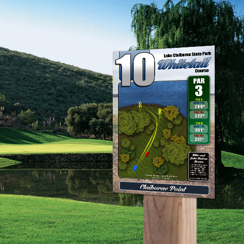
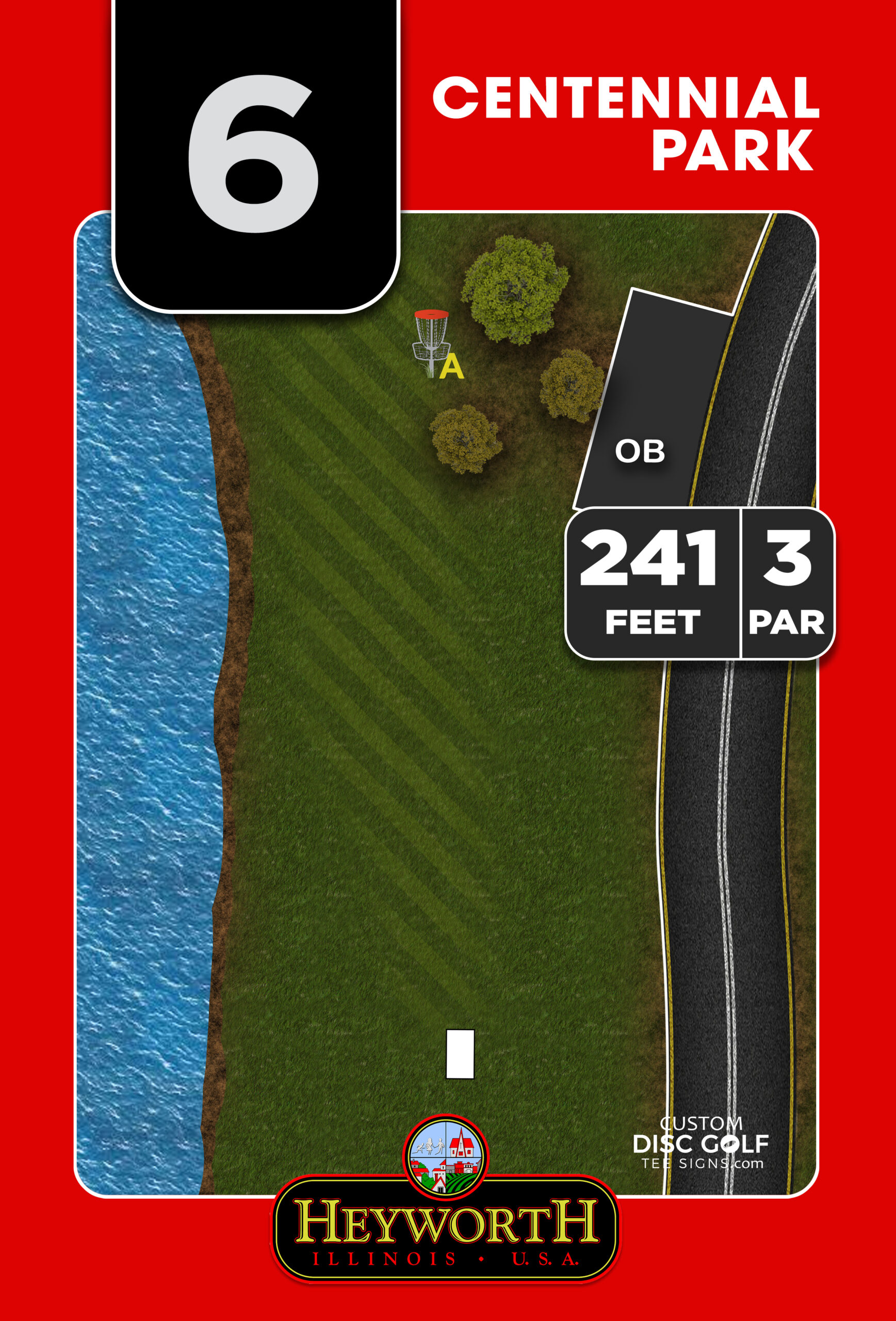
The map is the heart of readability
If you want the shortest answer to what makes tee signs easy to read, it is this: a clear hole map. Most players can work around small text problems. They cannot work around a confusing map.
A good tee sign map shows the tee, fairway shape, major obstacles, out-of-bounds areas if relevant, and the basket location with enough clarity that players can understand the intended play line. The map should simplify the hole, not over-illustrate it. Every tree does not need to be drawn. Every contour does not need to be labeled. The purpose is to help the player understand position, direction, and risk.
Scale is one of the biggest factors here. If the map is too small, readability falls apart no matter how good the artwork is. This is why sign size and content have to be planned together. A long championship hole with multiple landing zones, water carries, or alternate basket placements often needs more map real estate than a short recreational hole. Trying to force all hole types into a design that is too compact usually creates clutter.
Orientation also matters. Players should be able to match the map to the landscape with minimal mental effort. In some cases, a north-up map is useful for consistency. In others, orienting the map to the player’s viewpoint makes faster sense on the tee. There is no single rule for every course, which is why custom layout work matters more than generic templates.
Font choice, text size, and contrast do the heavy lifting
Readable tee signs use fonts that are clean, simple, and large enough to be seen outdoors. Decorative fonts may look distinctive on a screen, but they usually underperform in the field. Sans serif fonts tend to work best because they stay legible at a glance and hold up better when viewed from a standing position in varying light.
Text size should match importance. Hole numbers need to be large. Distances and par should be strong and clear. Supporting labels can be smaller, but not so small that players need to walk up and study the sign at close range. This is especially important on public courses where players of different ages and visual abilities use the same signage.
Contrast is just as critical as font size. Black or dark text on a light background is usually the safest choice. White text can work well on a dark field, but only when the contrast is strong and the background stays visually calm. Busy photographic backgrounds, low-contrast color combinations, and overuse of gradients can make even well-written information harder to read.
Color still has an important role. It can separate information categories, reinforce branding, and make maps easier to interpret. But color should guide the eye, not distract it. Good color use creates structure. Poor color use creates noise.
What makes tee signs easy to read in real outdoor conditions
Designing for a computer screen is not the same as designing for a park. Tee signs are viewed in glare, shade, rain, dust, and changing seasonal light. They also need to remain readable after months and years of UV exposure.
That is why material and print quality affect readability just as much as layout. A well-designed sign can lose clarity quickly if colors fade, coatings fail, or surface glare becomes excessive. Durable substrates such as aluminum composite or aluminum, paired with UV-protected full-color printing, help preserve both the map and the text over time.
This is one area where decision-makers sometimes focus only on upfront cost. Budget matters, especially for volunteer-led upgrades and municipal projects, but replacement cycles matter too. A sign system that looks sharp for years often creates better value than a cheaper sign package that starts fading, warping, or losing legibility early.
There is also a practical maintenance side to readability. Signs should be mounted at a comfortable viewing height and positioned where players can approach them easily from the tee. If a sign is hidden behind growth, angled into harsh sunlight, or placed where groups cannot gather around it, even a strong design becomes less effective.
Consistency across the course builds trust
A single readable sign helps on one hole. A consistent signage system helps across the entire course.
When every sign uses the same structure, icons, labeling style, and sponsor treatment, players become faster at reading them. That reduces hesitation and confusion, especially on unfamiliar courses. It also raises the perceived quality of the facility. Organized signage tells players the course is managed well, cared for, and worth respecting.
For municipalities, parks departments, and clubs trying to bring a course to a higher standard, consistency is one of the fastest visual upgrades available. It strengthens branding, supports events, and makes the course easier to navigate for casual players and tournament visitors alike.
This is also where a disc-golf-specific design process makes a real difference. Tee signs are not general business signs. They have a unique job, a unique audience, and a very specific set of information priorities. A design team that understands hole flow, basket movement, sponsor placement, and on-course decision-making will usually produce a more readable result than a generic sign provider.
Readability is a design decision, not an accident
The easiest tee signs to read are usually the result of discipline. They use space well. They give the map room to work. They make the key numbers obvious. They account for outdoor conditions. And they respect the player’s need to understand the hole quickly.
That does not mean every course should use the same exact format. A beginner-friendly nine-hole park course may need a simpler sign package than a championship-level layout with long fairways, multiple pins, and strong sponsor support. The right solution depends on the course, the audience, and the project goals. But in every case, readability should lead the design conversation.
When a tee sign is easy to read, players notice the course less as a puzzle and more as a place to play. That is the kind of improvement that feels immediate on day one and keeps paying off every round after that.