Best Disc Golf Welcome Sign Ideas for Courses
A player should know where to park, where to start, and what kind of course they are about to play before they ever pull a disc from the bag. The best disc golf welcome sign ideas do more than mark an entrance. They establish course identity, reduce confusion, communicate expectations, and give a park or club a more professional first impression.
For municipalities, park departments, clubs, and volunteer-led course projects, a welcome sign is often the highest-visibility piece of the entire signage system. It needs to work for first-time visitors, tournament players, families, and maintenance staff while holding up through sun, rain, vandalism, and changing course conditions. The strongest approach is not simply making the sign larger. It is deciding what information belongs at the entrance and presenting it in a clear, durable format.
Start With the Job Your Welcome Sign Must Do
An entrance sign has a different job than a tee sign. Tee signs explain a single hole. A welcome sign or course overview sign orients the player to the whole property and sets expectations for the round ahead.
Before choosing a layout, identify the most common questions people ask when they arrive. Is this the correct parking lot? Where is hole 1? Is there a practice basket? Which layouts are available? Are there park rules, seasonal restrictions, or safety concerns? The best sign answers these questions quickly, without forcing visitors to read a wall of text.
A well-planned welcome sign usually includes the course name, a clear map, a prominent hole 1 marker, and essential course or park rules. From there, the design can support the personality and operational needs of the facility. A championship course may need tournament information and multiple layouts. A compact community course may benefit most from simple navigation and family-friendly rules.
Best Disc Golf Welcome Sign Ideas That Improve Arrival
Build the sign around a course map
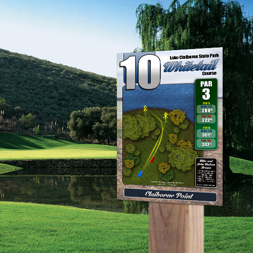
The course map should be the visual center of most welcome signs. It helps players understand the property before they begin walking, which is especially valuable on multi-use parks, wooded courses, and facilities with long transitions between holes.
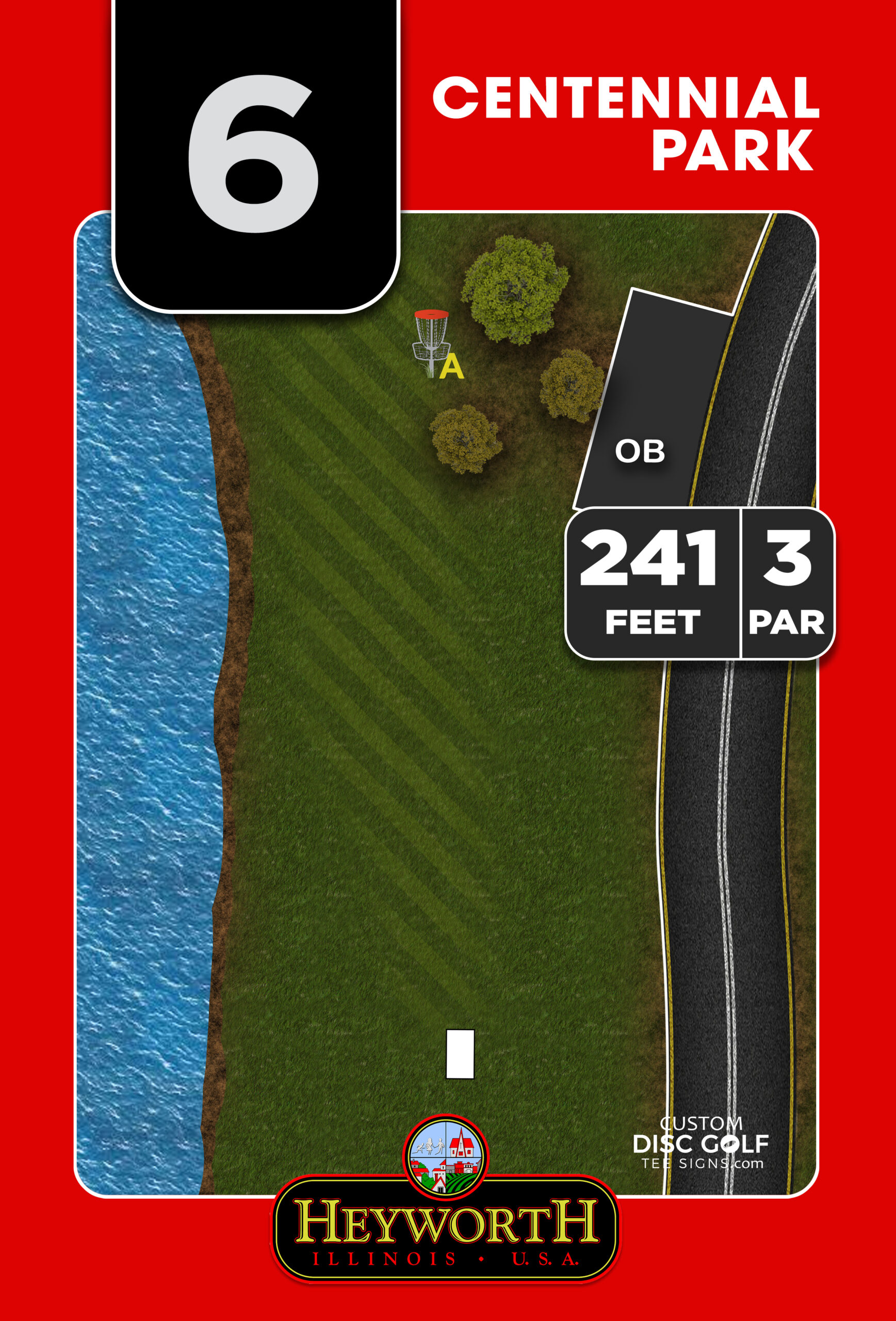
Use high-contrast fairway lines, tee locations, basket positions, parking, restrooms, practice areas, and walking paths. Clearly distinguish alternate pins, short tees, long tees, or separate layouts when they are in use. A map that is attractive but difficult to read from several feet away will not solve navigation problems.
Avoid treating the map as a miniature satellite image. Too much detail becomes visual noise. The goal is quick orientation, not a complete survey of the park. A custom illustrated course map gives designers more control over clarity, branding, and useful landmarks.
Make hole 1 impossible to miss
Many first-time players lose time at the entrance because they cannot find the opening tee. A bold directional element such as “Start Here,” an arrow, or a highlighted route to hole 1 makes the welcome sign immediately useful.
If hole 1 is not visible from the parking area, pair the welcome sign with a separate directional sign at the decision point. This is a small addition that prevents players from wandering toward hole 10, walking through an event area, or crossing a fairway. Good course navigation works as a system, not as one sign trying to do every job.
Give the course a recognizable identity
A welcome sign is the ideal place for a course logo, park identity, city seal, club name, or a custom course illustration. These details make the facility feel intentional and give tournament directors, sponsors, and local players a visual asset they can rally around.
The design should match the setting. A wooded state park course may use natural colors and an illustration tied to the landscape. A city recreation course may call for a clean, municipal look that aligns with existing park signage. The key is consistency. The same colors, fonts, and logo treatment should carry through to tee signs, directional signs, and course maps.
Add rules people will actually read
A welcome sign is the right place for a concise code of conduct. Keep it limited to rules that matter at the property: yield to other park users, pack out trash, keep dogs leashed where required, do not alter vegetation, respect posted closures, and avoid throwing when pedestrians are in range.
Long rule blocks are rarely read. Use short, plain statements and reserve detailed policies for a nearby kiosk, park website, or event materials. If alcohol restrictions, hours, payment requirements, or wildlife protections apply, those should be visible enough that visitors cannot claim they missed them.
Include a scorecard or QR option only when it serves the course
A printed scorecard panel can be useful at a busy public course, particularly when new players and casual groups make up a large share of traffic. It can show pars, distances, and basic layout information. However, it also needs routine replenishment and can become cluttered if the kiosk is not maintained.
A QR code can direct players to a digital scorecard, event page, or course updates. It is a helpful secondary tool, not a substitute for the map and basic information on the sign itself. Cell service may be inconsistent, batteries die, and many players simply want to start their round without opening a phone.
Use Sponsors Without Letting Them Take Over
Sponsor recognition can make a signage project more achievable, especially for clubs, Eagle Scout projects, and community improvement efforts. A welcome sign provides valuable visibility because every player sees it, but the sponsor area should be structured so it supports rather than overwhelms the course brand.
A dedicated sponsor band along the bottom or side of the sign is usually the cleanest solution. It gives local businesses meaningful exposure while keeping the course map and navigation information easy to find. For larger projects, consider a tiered placement system: a presenting sponsor at the entrance, then individual hole sponsors on tee signs.
Set expectations early. Decide how long sponsor recognition will remain in place, whether renewals are available, and how logos will be submitted. Consistent logo sizing and a defined sponsor area prevent the sign from turning into a patchwork of competing graphics.
Choose Materials for the Location, Not Just the Budget
A welcome sign is exposed every day, so material choice matters. Aluminum composite and aluminum are popular options for disc golf facilities because they are durable, weather-resistant, and well suited to full-color, UV-protected printing. They offer a cleaner, more permanent presentation than temporary banners, plywood, or laminated paper signs.
The right substrate depends on the installation environment and the desired lifespan. A high-traffic municipal course, exposed open field, or destination facility should prioritize a rigid, long-term material and secure mounting hardware. A volunteer project with a limited budget may begin with a simpler sign package, provided the core map and navigation remain clear.
Think about sun angle, mower access, snowplow routes, and vandalism risk before finalizing placement. A beautiful sign that faces intense afternoon glare or sits directly in a vehicle path will create avoidable maintenance problems. Position it where players naturally pause after parking, with enough room for groups to gather without blocking traffic.
Design for Updates Before You Need Them
Courses change. Baskets move, alternate layouts are added, construction affects access, and park policies evolve. The most practical welcome sign designs anticipate that reality.
For permanent information such as the course name, logo, and main map, a full-color durable panel is the right foundation. For elements likely to change, consider a companion bulletin area, replaceable insert, or separate temporary notice panel. This keeps updates from becoming an expensive redesign of the entire entrance sign.
It also helps to establish one approved source for course information. When the club, park department, and tournament staff all post different maps or layout notes, players receive mixed messages. A professionally designed welcome sign can become the visual standard that keeps the entire course communication system aligned.
Create a Sign Package Instead of a Standalone Entrance Piece
The best welcome sign performs even better when it is part of a coordinated package. The entrance sign gets players oriented, directional signs guide them through transitions, tee signs explain the holes, and a course overview or tournament board handles changing announcements.
This does not mean every project needs the largest package on day one. It means planning the visual system so future additions look intentional. Start with the highest-impact pieces, then expand as funding, sponsorships, or park approvals become available. Consistent artwork and materials make phased improvements feel like one professional project rather than a collection of unrelated signs.
Custom Disc Golf Tee Signs helps course leaders turn that plan into a practical design and proofing process, with custom artwork, sponsor-ready layouts, durable materials, and shipping included. The result is signage that reflects the quality of the course rather than asking players to overlook its weak spots.
When visitors can step out of the car, see where they are, understand where to go, and recognize that the course is cared for, the round starts better before the first throw.