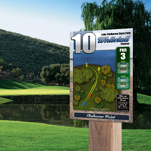
7 Best Sponsorship Layouts for Tee Signs

A sponsor panel that looks good in a mockup can still fail once it is mounted on a tee pad. If the hole map gets crowded, the yardage is hard to find, or every sponsor logo fights for attention, the sign stops doing its main job. The best sponsorship layouts for tee signs protect readability first, then create sponsor space that feels intentional, professional, and worth paying for.
For clubs, parks, and course managers, that balance matters. Sponsors help offset project costs, but poor placement can make the entire course feel cluttered or inconsistent. A strong layout gives businesses clear visibility without turning your tee signs into billboards. It also makes approvals easier because stakeholders can see that sponsor support improves the course instead of distracting from it.
What makes tee sign sponsorship layouts work
The strongest sponsorship layouts start with hierarchy. Players should be able to find the hole number, par, distance, and fairway shape in a glance. Sponsor placement comes after those essentials, not before them. When layout order is wrong, the sign may technically include all required information, but players still experience it as confusing.
Size is the next factor. Sponsors want enough room to be recognizable, but large logos are not always better. A clean, well-proportioned sponsor area often delivers more value than oversized logos packed around the edges. Good design gives each sponsor a defined place, consistent spacing, and enough contrast to remain legible outdoors in changing light.
Material and production also affect layout decisions. On a full-color aluminum or aluminum composite tee sign, detailed logos can reproduce well, but they still need room to breathe. Small type, thin outlines, and logos placed over busy background art tend to lose impact once installed. That is why sponsor strategy should be considered during the design phase, not squeezed in after the hole map is finished.
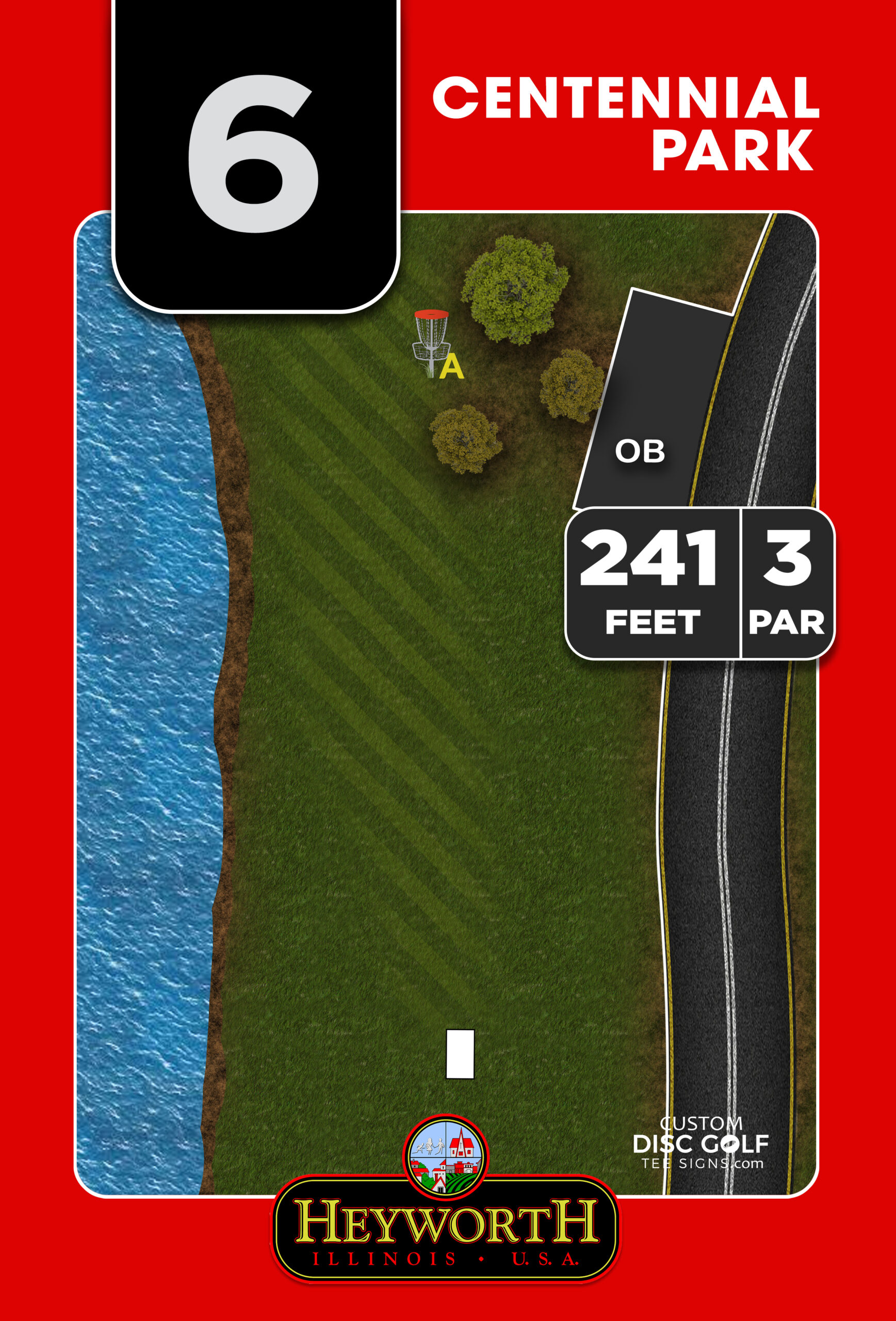
1. Bottom banner layout
The bottom banner is one of the best sponsorship layouts for tee signs because it is easy to organize and easy for players to understand. The main sign content stays in the upper two-thirds or three-quarters of the panel, while a horizontal sponsor band runs across the bottom. That keeps sponsor recognition visible without competing with navigation.
This format works especially well for public courses, municipal projects, and club-led upgrades where consistency across all 18 signs is important. Every sign can use the same sponsor zone, even if some holes have one sponsor and others have several. The result feels professional and repeatable.
The trade-off is space. A bottom banner reduces the vertical room available for the hole diagram and notes. On signs with long fairway maps, alternate pin positions, multiple tee pads, or more detailed OB information, that extra lost height may matter. In those cases, the banner has to be proportioned carefully so the sign does not feel cramped.
2. Right-side sponsor column
A right-side column gives sponsors a dedicated vertical area while preserving a large, uninterrupted map zone. This layout is a strong option when hole maps are wide rather than tall, or when your design includes a landscape-oriented fairway illustration.
A side column can also create a premium feel for sponsor listings because each business gets a stacked placement instead of being compressed into a strip. For clubs selling tiered sponsorships, this setup makes it easier to vary placement size while keeping the overall sign structure intact.
It does require discipline. If the sponsor column becomes too wide, the map and key stats start to feel squeezed. If logos vary wildly in shape and color, the side panel can look messy unless it is carefully standardized. This is where professional layout design matters. A column only works when spacing, logo scaling, and alignment are handled consistently across the full course package.
3. Single featured sponsor block
Some courses do best with one featured sponsor per hole. In that case, a single sponsor block is often the cleanest answer. Instead of trying to fit several logos into a small area, the sign gives one business a clearly defined placement with enough size to feel valuable.
This layout is ideal for hole sponsorship programs, memorial sponsorships, and fundraising campaigns where each sponsor is tied to a specific hole. It simplifies sales, simplifies approvals, and keeps the sign visually strong. Players notice the sponsor, but the sign still reads as a course tool first.
The obvious limitation is revenue density. If your funding model depends on placing several sponsors on every sign, one featured block may not generate enough income. But for many projects, especially higher-end course installations, fewer sponsors with better presentation can be more effective than many sponsors with poor visibility.
4. Tiered sponsor panel
A tiered panel works well when you have different sponsor levels and need the sign system to reflect that structure. In this format, top-tier sponsors receive larger placements, while supporting sponsors are grouped below in smaller but still organized positions. This gives clubs and parks a practical way to price visibility without redesigning every sign from scratch.
The key is restraint. If too many levels are introduced, the sign starts to look like an event poster. Most tee signs work best with two, or at most three, sponsor sizes. That keeps the value difference visible without making lower-tier sponsors feel like an afterthought.
For community-driven projects, this approach can be very useful. It lets a local headline sponsor stand out while still making room for smaller businesses that want to support the course. Done correctly, it communicates a structured sponsorship program rather than a collection of unrelated logos.
5. Course-branded sponsor footer
A sponsor footer blends business recognition into the course identity. Instead of a plain row of logos, the sponsor area is designed as part of the overall sign system, using matching colors, border treatments, and typography. This is one of the strongest choices for courses that want to raise their visual standard while still funding signs through sponsorships.
This format is especially effective on professionally designed, full-color signs where the sponsor zone is integrated from the beginning. It gives the entire panel a polished look and prevents the sponsor section from feeling tacked on.
The challenge is that branded footers are less forgiving of poor logo files or inconsistent sponsor materials. If one business submits a low-resolution image and another submits a logo with an odd background box, the footer can break visually. A managed proofing process solves much of that problem by standardizing how sponsor art appears before production.
6. Rotating sponsor family layout
Not every project has the same sponsor structure across every hole. Some courses have a major sponsor on a few marquee holes, while others rely on shared support from several local businesses. A rotating sponsor family layout creates a consistent framework that can flex from sign to sign.
For example, the same sign design might support one large logo, two medium logos, or four smaller logos within the same reserved area. That flexibility helps when fundraising comes together unevenly, which is common in volunteer-led and community-backed projects.
The advantage is adaptability. The risk is inconsistency if the flexible area is not planned properly. A layout system should still look complete whether it contains one sponsor or four. Empty boxes and awkward spacing make the sign feel unfinished, so the design needs to be built with variable use in mind.
7. Separate sponsor plaque zone within the sign system
For some courses, the best sponsorship strategy is not to maximize logo count on the printed face at all. Instead, the tee sign system can include a designated area for a sponsor plaque or modular sponsor panel. This separates navigation graphics from sponsorship while keeping both pieces tied together visually.
This approach works well for courses that expect sponsor turnover. If a sponsor changes, the smaller panel can be updated without replacing the full tee sign. That can protect the long-term value of the project and make sponsor maintenance more manageable.
It is not the right fit for every installation. Additional components can affect budget, mounting details, and production planning. But when long-term flexibility matters, a modular sponsor area can be a smart operational choice, not just a design choice.
How to choose the best layout for your course
The best layout depends on how your course raises funds, how much information each hole sign needs, and how polished you want the final system to feel. A simple 9-hole community course may do very well with a single sponsor block or bottom banner. A championship-level course with detailed maps and stronger branding standards may need a more controlled footer or side-column approach.
It also depends on who is approving the project. Park departments and municipalities often prefer layouts that prioritize public readability and a clean visual standard. Clubs and volunteer organizers may need more flexibility to fit a range of sponsor commitments. Neither priority is wrong, but the design should reflect the real decision-making environment.
At Custom Disc Golf Tee Signs, this is where a course-specific design process makes a difference. Sponsor placement works best when it is planned alongside hole maps, branding, materials, and proofing rather than added at the end.
Common mistakes to avoid
The most common mistake is giving sponsors too much control over the sign face. Sponsors deserve visibility, but the course still needs a readable, cohesive sign system. Another frequent problem is inconsistent placement from hole to hole, which makes the course look pieced together even when the signs are newly installed.
Low-quality logo files also create avoidable issues. Outdoor signs are durable, but bad artwork still looks bad when printed. The same goes for overcrowding. Adding one more sponsor may help the budget on paper, but if the sign becomes harder to read, the course pays for it in player experience.
A good tee sign should look like part of a complete course infrastructure plan, not a last-minute fundraiser. When sponsors are integrated with intention, they support the course visually and financially at the same time.
The right layout does more than fit logos onto a panel. It helps your course look organized, funded, and cared for – and that is exactly what players, sponsors, and stakeholders notice when they step onto the first tee.