Course Branding Signage That Builds Better Rounds
A player standing on hole one should not have to guess where the fairway goes, which basket position is in play, or whether they are on the right course. Effective course branding signage answers those questions before the first throw. It also gives your facility a recognizable, professional presence that players remember, recommend, and respect.
For clubs, parks departments, municipalities, and volunteer-led course projects, signage is often treated as a final detail. In practice, it is one of the most visible parts of the course. Players interact with tee signs, maps, and directional markers throughout the round. When those pieces work together, they improve pace of play, reduce confusion, support maintenance goals, and raise the perceived standard of the entire property.
Course Branding Signage Starts at the Tee
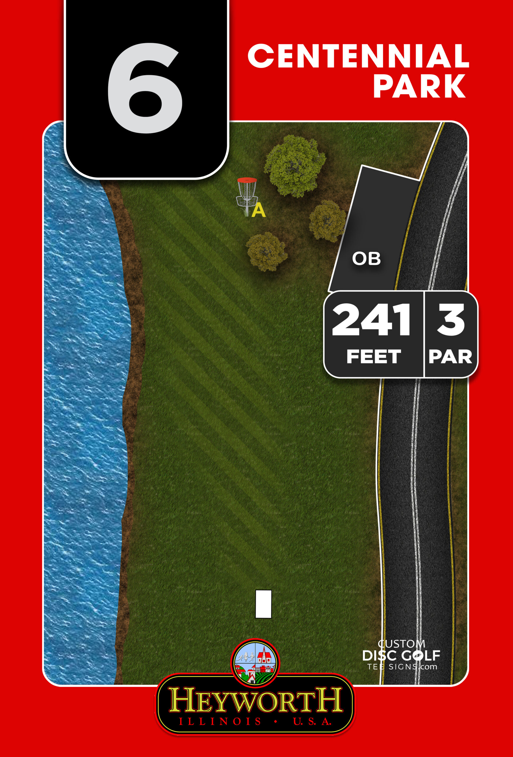
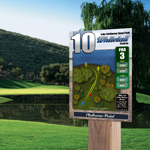
A tee sign has a job to do before it has a chance to look good. Players need reliable hole information: distance, par, intended line, hazards, out-of-bounds areas, alternate pin locations, and the next-tee direction when necessary. A clean layout makes that information easy to scan quickly, even when a group is waiting behind them.
The strongest signs do not force players to interpret a cluttered aerial image or hunt for a tiny distance number. They establish visual hierarchy. Hole number, par, and distance should be immediate. The fairway map should show the route clearly. Course rules, sponsor recognition, and design details should support the player experience rather than compete with it.
That balance is where course-specific design matters. A wooded technical hole needs different visual emphasis than an open championship fairway. A multi-use city park may require clear language around pedestrian areas and shared paths. A course with multiple layouts needs a system that distinguishes tees and baskets without turning every sign into a wall of information.
Make the information useful at playing speed
Players do not study tee signs under ideal conditions. They look at them in bright sun, rain, wind, and the middle of a casual round. Use high-contrast colors, readable type, and maps that communicate the intended flight path at a glance. If a sign contains critical rules or safety notes, those messages need enough size and spacing to be noticed.
There is a trade-off. Adding every possible detail can feel thorough during a committee review, but it can make the finished sign harder to use. Prioritize what players need at that exact location. General park rules and event notices may belong at the kiosk or course overview instead of on all 18 tee signs.
Build a Sign System, Not a Collection of Signs
A branded course feels organized because its signs share a consistent visual language. The course logo, colors, typography, map style, icons, and layout should tell players they are moving through one connected facility. That consistency is especially valuable on public courses, where the first impression can shape how visitors view the club, city, or park department responsible for the property.
Start with the entry point. A course overview sign or kiosk should orient first-time visitors, establish the course name and identity, and show how the property is laid out. It can include a full map, rules, contact information, event notices, and recognition for project partners. From there, tee signs carry the same visual identity into the round, while directional signs keep players moving confidently between holes.
The system should account for the moments where confusion usually happens: parking areas, practice baskets, first tees, course splits, long walks to the next hole, and shared use zones. If players regularly ask where hole 12 starts, the answer should be a durable directional sign, not a handwritten arrow on a tree.
Use your setting as a design input
Course identity should fit the property. A state park course may call for colors and graphics that complement the natural setting. A municipal recreation course may benefit from city branding and clear community-use messaging. A private destination course can lean into a more premium look that supports tournament play and merchandise.
This does not mean every sign must be elaborate. Basic navigation signage can still feel polished when it uses a consistent layout and professional artwork. Premium custom-shaped signs, full-color maps, and championship-level graphics make sense when the course is positioning itself as a regional destination or hosting major events. The right package depends on the course’s goals, budget, and expected traffic.
Choose Materials for the Real Conditions on Your Course
A sign that looks sharp on installation day but fades, warps, or peels after a season does not protect your investment. Disc golf signage lives outdoors. It must stand up to ultraviolet exposure, moisture, temperature changes, mowing equipment, thrown discs, and the occasional vandalism concern.
Durable UV-protected materials are a practical requirement, not an upgrade for appearances alone. Aluminum composite is a popular choice for a reason: it provides a rigid, professional-looking panel that performs well outdoors. Aluminum is another strong option where the project calls for its specific durability and finish characteristics. The correct substrate depends on mounting method, local conditions, budget, and the intended lifespan of the sign system.
Consider the mounting hardware and location at the same time as the sign material. Low-mounted signs can be easier for players to read but may be exposed to trimming equipment. Signs near baskets or busy park paths need placement that avoids creating obstacles. In heavily wooded areas, branches and falling debris may influence where posts should go. Good design is only part of the solution; thoughtful field planning protects it.
Create Sponsor Space Without Selling Out the Design
Sponsorship can turn a difficult capital project into an achievable one. Local businesses, disc golf supporters, civic organizations, and individual donors often want a visible connection to a course improvement they helped fund. A well-designed sponsor area gives them recognition while preserving the purpose of the sign.
The key is to define the sponsor format early. Will each hole have one primary sponsor? Will several supporters appear on a course map or kiosk? Are logos standardized in size? Can sponsors change each year? Those decisions affect the layout, production plan, and long-term maintenance of the program.
Sponsor panels should be intentional, not an afterthought squeezed into unused space. Keep logos readable and contained within a consistent zone. If recognition becomes too prominent, the sign can feel more like an advertisement than a player resource. If it is too small, it may not provide enough value to help secure funding. A balanced design respects the sponsor and the player at the same time.
For Eagle Scout projects, club-led fundraisers, and municipal improvement efforts, sponsor-ready signage also makes the proposal easier to explain. Supporters can see exactly what they are funding, where their recognition will appear, and how the completed project benefits the wider community.
Keep the Approval Process Moving
Signage projects often involve more stakeholders than expected. A course designer may need to verify fairway maps. A parks department may need to approve logos and rules. Club leaders may be coordinating sponsors, while volunteers are handling site measurements and installation. Without a clear process, even a straightforward order can stall.
Begin by gathering accurate course information: hole distances, pars, tee and basket locations, layout variations, hazards, branding files, sponsor requirements, and any required park language. Current aerial imagery and field notes are helpful, but the people who know the course best should review every hole map before production.
A structured design-to-proofing workflow gives stakeholders a chance to catch errors while they are still easy to correct. Proofs should be reviewed for both visual quality and operational accuracy. Is the basket shown in the current position? Does the hole number match the tee? Is the next-tee arrow correct? Are sponsor names spelled correctly? These details matter because replacing an installed sign takes more time and money than reviewing a proof carefully.
Assign one point person to consolidate feedback whenever possible. Multiple uncoordinated edit requests can slow approvals and create conflicting instructions. A clear decision-maker helps the project move from design to production with fewer delays.
Plan for Maintenance Before Installation
Even the best-made signs need an occasional inspection. Course changes happen. Baskets move, alternate layouts are added, rules are updated, and sponsors rotate. A good signage plan makes those future changes manageable.
Ask which information is likely to change over the next few years. If pin positions rotate frequently, the tee sign may need a clear way to identify the active location. If sponsors change annually, a dedicated replaceable sponsor panel may make more sense than rebuilding the full sign. If a course expects expansion, leave room in the overview map for future holes or plan for an update rather than forcing a temporary fix.
Keep a final approved copy of every sign file and maintain a simple inventory of sign locations, dimensions, and installation dates. That record helps when one panel is damaged or when the course needs a coordinated refresh. It also gives future club officers or park staff a reliable starting point instead of making them reconstruct the project from scratch.
Bring the Course to a Higher Standard
Professional signage does more than make a course look finished. It communicates that the people behind the course care about safety, navigation, accessibility, and the player experience. It gives tournament directors a more dependable facility, gives new players confidence, and gives local supporters a visible reason to be proud of their investment.
The best time to address course branding is before small signage problems become part of the course’s reputation. Start with the player journey, identify where information is missing, and build a durable visual system around the course you actually have. A well-planned sign at the right place can save a player from a wrong turn, help a sponsor see real value, and make every round feel more complete.