How to Create Tee Sign Artwork That Works
Bad tee sign artwork usually fails in the same place – not on the computer, but on the tee pad. A sign can look sharp in a proof and still confuse players, bury sponsor logos, or make hole information hard to read from a few feet away. If you’re figuring out how to create tee sign artwork, the goal is not simply to make something attractive. It is to build a sign system that helps players move confidently through the course and gives your facility a more professional standard.
For clubs, park departments, course managers, and volunteer-led projects, that distinction matters. Tee signs are part wayfinding, part course branding, and part long-term infrastructure. Good artwork supports play today and still holds up when the course gets busier, sponsorships change, or layouts evolve.
Start with function before style
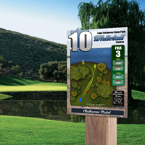
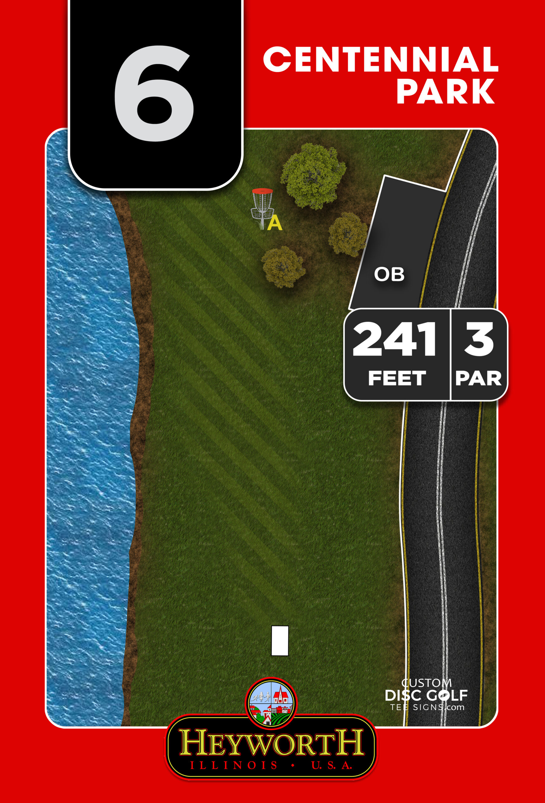
The most common mistake in tee sign design is starting with colors, logos, and visual effects before the actual hole information is organized. Players approach a tee sign looking for a few specific answers. They want to confirm the hole number, tee location, basket location, distance, par, and route. On many courses, they also need out-of-bounds, mando, hazards, alternate pin positions, and next-tee direction.
That means the artwork needs a clear hierarchy. The most important information should be visible first, not hidden inside a decorative layout. If the hole map, distance, and basket position compete equally with club branding and sponsor graphics, the sign becomes slower to read.
A strong tee sign usually puts the hole identity at the top, the map in the main focal area, and supporting data in clean, consistent positions. That structure sounds simple, but it is what gives a sign system its professional feel. Consistency across all holes matters almost as much as the design of any one sign.
How to create tee sign artwork with the right source material
Before anyone opens a design file, gather the course information that will actually drive the artwork. This is where many projects either stay efficient or get delayed. If the distances are inconsistent, the hole maps are rough, or there is no clear decision on branding and sponsor placement, the design stage turns into revision after revision.
Start with accurate layout references for every hole. That can include aerial views, course maps, GPS measurements, drone images, or marked-up photos. You also need the practical details that players rely on – par, distances from each tee, basket positions if there are multiple sleeves, and any mandatory route notes.
Just as important, decide early what the signs need to accomplish beyond basic navigation. Some courses want a clean tournament-level presentation. Others need sponsor visibility to help fund the project. Municipal courses may need park branding and rules integration. A private facility may want a stronger branded look that reflects the course identity. None of those goals are wrong, but they do change the artwork.
If your course has multiple stakeholders, it helps to appoint one point of contact who can consolidate feedback. That keeps the artwork process moving and prevents conflicting direction from club leadership, parks staff, and sponsors.
Build the layout for readability in real conditions
A tee sign is viewed outdoors, often in glare, shade, rain, and motion. Players are not sitting still and studying it like a brochure. They glance, confirm, and throw. That changes how artwork should be built.
Readable design starts with contrast. Dark text on a light field or light text on a dark field works best when there is enough separation. Thin type, low-contrast color combinations, and busy image backgrounds are some of the fastest ways to reduce legibility. On screen they may look refined. On an installed sign, they often become frustrating.
The hole map should be the visual anchor. It needs enough scale to show the route clearly, including fairway shape, major obstacles, water, OB, and green location. If everything is reduced to make room for oversized logos or decorative textures, the map loses value. A tee sign is not a poster. It is an operational tool.
Font choice matters too. Stick with clean, readable typefaces and use them consistently. You do not need three or four font styles to make the sign look custom. Usually, one strong display style for the hole number and one simple sans serif for the supporting information is enough.
Make sponsor placement part of the design, not an afterthought
For many public and club-led projects, sponsorships help make the signage budget possible. That is a practical advantage, but only if sponsor areas are built into the sign artwork intentionally.
The best sponsor-supported signs reserve a dedicated zone for logos or business names without interfering with the hole map. When sponsor placement is squeezed into leftover space, the result usually feels cluttered and uneven. When it is planned from the beginning, sponsors get cleaner visibility and the course still keeps a polished presentation.
There is a trade-off here. More sponsor space can offset project costs, but it also reduces space available for hole information. The right balance depends on your funding model, sign size, and the complexity of the hole layouts. A heavily wooded championship course with technical routing often needs more map space than an open recreational course.
If sponsor rotations may change over time, build the artwork system in a way that makes those updates manageable. Consistent sponsor blocks or modular areas are easier to update than fully custom placements on every sign.
Use course branding carefully
Branding should strengthen recognition, not crowd the sign. A course logo, park identity, or club mark can absolutely elevate the final result, especially when the rest of the course infrastructure is being improved at the same time. But branding works best when it supports the design rather than dominating it.
That usually means using a controlled color palette, repeating a few consistent visual elements, and keeping the core hole information front and center. If every sign has a different style, border treatment, or background graphic, the system starts to feel improvised.
This is where professional tee sign design separates itself from generic sign production. Disc golf signage has its own priorities. You are not designing a retail sign or a flyer. You are building a course-wide information system that needs to feel unified from hole 1 through 18 or beyond.
Match the artwork to the material and print method
One part of how to create tee sign artwork that gets overlooked is the final substrate. A design file does not live in isolation. It ends up printed on a physical sign that will be outdoors in UV exposure, weather, and daily use.
That affects design decisions. Fine details, very thin linework, and tiny labels may not perform as well as expected once printed and installed. Color can also appear different on finished material than it does on a backlit screen. Durable outdoor signs benefit from clean shapes, strong contrast, and artwork built at proper resolution from the start.
If your project includes aluminum composite or aluminum signs, the design should be prepared with production in mind, not adapted at the last minute. Bleeds, safe margins, mounting areas, and final dimensions all matter. The cleaner the file setup, the smoother the proofing and production process.
Review proofs like a course manager, not just a designer
When proofs come back, many buyers look first at whether the sign looks good. That matters, but it should not be the only standard. Review each sign as if you are a first-time player standing on the tee.
Can you find the basket quickly on the map? Is the next tee direction obvious? Are the distances correct and consistent with the scorecard or course app? If there are alternate basket positions, are they clearly labeled? If there are hazards or mandatory routes, can a player understand them at a glance?
This is also the right time to check for consistency across the full set. Make sure hole numbers, color use, labels, sponsor areas, and map style all feel unified. One strong sign is not enough. A course feels professional when the entire sign package works together.
For larger projects, a structured proofing process saves time. Consolidated revisions are more efficient than scattered comments from multiple people at different stages. That is especially true for municipalities, club boards, and Eagle Scout or community-led projects where several stakeholders may need approval.
When to design in-house and when to use a specialist
Some organizations have in-house design capability. If that team also understands disc golf flow, outdoor signage requirements, and production setup, an internal approach can work. But many projects run into trouble when a general designer handles the artwork without understanding how players actually use tee signs.
Disc golf-specific design is about more than making a sign look modern. It means knowing how to interpret hole layouts, where sponsor placements make sense, how to preserve readability, and how to keep an 18-hole system consistent from first proof to final shipment.
That is why many courses choose a specialized partner rather than starting from scratch. A focused workflow, course-specific artwork, and a proofing process built around signage projects usually lead to faster approvals and stronger results. Custom Disc Golf Tee Signs works in that lane because the work is built around actual course use, not generic signage assumptions.
The best artwork is the kind players barely have to think about. It guides them, represents the course well, and makes the entire property feel more established. If your sign design decisions stay centered on clarity, consistency, and real on-course use, the finished system will do more than fill a post – it will raise the standard of the course.