Disc Golf Signage Trends That Matter
A course can have great baskets, smart shot design, and solid maintenance, then still feel unfinished the moment players step onto a tee and see outdated, unclear, or inconsistent signage. That is why disc golf signage trends matter right now. For clubs, parks departments, and course managers, signage is no longer a small add-on. It is part of the course experience, part of the brand, and often part of the funding strategy.
What has changed is not just style. Buyers are asking more of every sign on the property. Tee signs now need to guide new players, support tournament play, hold up outdoors, present sponsors professionally, and fit the identity of the course. The strongest projects are moving away from generic layouts and toward complete sign systems built around how the course actually plays.
The biggest disc golf signage trends on modern courses
The clearest trend is a shift from single signs to coordinated systems. A strong course does not rely on one tee sign format and hope the rest works itself out. It uses tee signs, directional signs, course overviews, and map boards that all look like they belong together.
That consistency does more than improve appearance. It reduces confusion, especially on multi-use park properties or wooded courses with longer transitions between holes. It also gives municipalities and sponsors something they can point to with pride. A cohesive sign package signals that the course is being managed professionally.
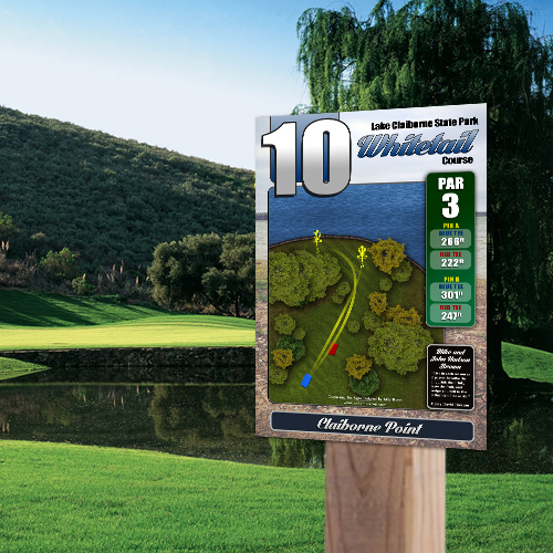
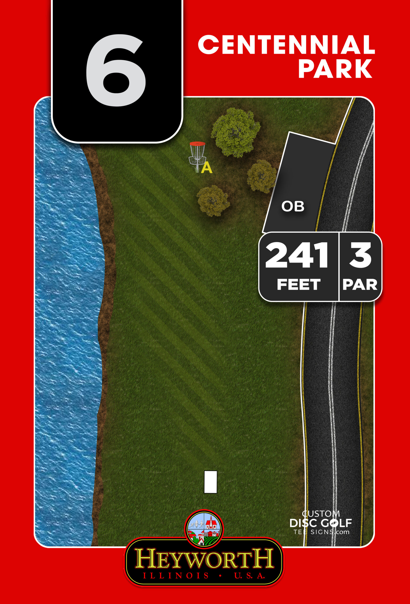
Another major shift is toward course-specific artwork. Decision-makers are moving away from template-driven signs that show the same icons and basic layout from one property to the next. Players expect a hole map that reflects the actual fairway shape, landing zones, hazards, alternate pin placements, and key obstacles. On more technical courses, that detail is not a luxury. It directly affects play.
This is especially important when a course serves different audiences. A beginner-friendly park course may need a cleaner, simpler map and more obvious next-tee guidance. A championship-level layout often benefits from more precise hole graphics, distance data, and pin indicators. Good signage design is adapting to the course, not forcing every course into the same format.
Better information, not just more information
One of the most useful disc golf signage trends is the focus on clarity over clutter. A few years ago, many signs tried to pack in everything at once. The result was often a crowded panel that looked impressive in a proof but was hard to read at the tee.
Now, stronger layouts are prioritizing fast decision-making. Players should be able to glance at a sign and understand the hole shape, distance, target position, out-of-bounds considerations, and where to go next. The design has to work in real outdoor conditions, with glare, shadows, rain, and players standing several feet away.
That means type size matters. Contrast matters. Icon placement matters. So does the balance between branding and play information. A logo can help establish identity, but it should not compete with the hole map. Sponsor placement can add project value, but it needs to be integrated in a way that feels intentional rather than squeezed into leftover space.
This is where experienced disc golf-specific design makes a difference. General signage principles help, but course signage has its own demands. The map needs to communicate strategy, not just geography.
Sponsor-ready design is becoming standard
Budgets remain one of the biggest obstacles in course improvement projects, so it is no surprise that sponsor integration continues to grow. One of the strongest trends in disc golf signage is designing signs from the start with sponsorship in mind.
That does not mean every sign needs a large ad block. In fact, oversized sponsor areas can weaken the player-facing purpose of the sign if handled poorly. The best sponsor-ready designs create a dedicated, consistent placement that looks professional across the full course. This gives clubs, municipalities, and volunteer organizers a practical way to offset costs without compromising readability.
For Eagle Scout projects, community-led installs, and club fundraising efforts, this matters even more. A structured sponsor area gives organizers something clear to present to local businesses. It turns signage from a pure expense into a project with a realistic funding path.
There is also a branding benefit. Sponsors are more likely to support a sign package that looks polished, durable, and well organized. A professionally designed tee sign makes a business name look like part of a legitimate community asset, not a temporary sticker on a post.
Durability is driving material choices
Not every signage trend is visual. Material performance is playing a bigger role in buying decisions, especially for public parks, high-traffic courses, and climates with heavy sun, moisture, or freeze-thaw cycles.
Course managers are paying closer attention to substrate quality, UV protection, and long-term readability. A sign that fades early, warps, or begins to peel can make the entire course feel neglected, even if the layout itself is excellent. Replacing failed signage too soon also turns a low upfront price into a more expensive long-term decision.
This is why more buyers are choosing durable materials like aluminum composite and aluminum for permanent installations. The right choice depends on the project. Some courses need a cost-conscious option that still presents well and lasts. Others want a premium finish for a flagship course, tournament venue, or municipal park upgrade.
There is no one-size-fits-all answer here. Budget, environment, expected traffic, and installation method all affect the right material choice. But the overall trend is clear: buyers are thinking less like printers and more like facility managers. They want signs that look sharp on day one and still represent the course well seasons later.
Custom shapes and elevated presentation
Another noticeable shift is the move toward more distinctive sign presentation. Standard rectangles still work well for many projects, and in plenty of cases they are the most efficient option. But premium courses and brand-conscious properties are increasingly interested in custom-shaped signs that reflect the character of the course.
That might mean incorporating a course logo silhouette, a state outline, a basket-inspired top edge, or another design feature that gives the sign more presence at the tee. Used well, custom shapes help a course stand out without making the sign harder to read.
The trade-off is cost and production complexity. Custom-shaped signs are not always necessary, especially when a course’s top priority is replacing missing or inconsistent signage quickly. But when the goal is to bring the course to a higher standard and create a stronger visual identity, upgraded presentation can have real value.
Workflow and proofing are part of the trend too
One of the less visible but most important changes in signage projects is the expectation for a smoother design-to-proofing process. Buyers do not just want a finished sign. They want a predictable path from course data to final approval.
That matters because signage projects often involve multiple decision-makers. A club may have a board. A city may have parks staff, procurement requirements, and branding guidelines. A volunteer-led project may need sponsor approvals and course designer input. Without a clear workflow, even a simple sign package can stall.
This is why more organizations are looking for partners who can manage custom artwork, revisions, and proofing efficiently. Fast turnaround only matters when the design process is organized enough to support it. The strongest signage projects are built on accurate hole information, responsive revisions, and proofs that make approval easier, not harder.
What course buyers should prioritize now
If you are planning a new install or replacing outdated signage, the smart move is not to chase trends for their own sake. It is to focus on which trends solve real problems for your course.
If navigation is a problem, a coordinated sign system should come first. If the course looks inconsistent, custom design and branding may deliver the biggest improvement. If budget is tight, sponsor-ready layouts can change the math of the project. If the course sits in a demanding environment, material durability should lead the conversation.
The strongest signage projects usually balance four things at once: readability, durability, course identity, and operational practicality. That balance looks different for every property. A city park with heavy casual traffic has different needs than a private pay-to-play venue or a wooded tournament course run by a club.
At Custom Disc Golf Tee Signs, that is exactly where a specialized approach matters. Disc golf signage works best when it is designed for the sport, built for the setting, and organized around the way real projects get approved and installed.
Good signage does not just mark a tee. It helps a course feel complete, easier to navigate, and worth talking about long after the round is over.