How to Standardize Course Signage for Disc Golf
A player standing on Hole 7 should not have to guess whether they are at the long tee, search for the basket location, or wonder where to walk after putting out. Those small points of confusion add up quickly, especially for first-time visitors, tournament players, and families using a public course. Learning how to standardize course signage gives every hole the same clear visual language and gives your facility a more professional presentation from the parking lot to the final basket.
For course managers, clubs, municipalities, and volunteer organizers, standardization is more than making signs look alike. It is a practical system for improving navigation, communicating accurate hole information, supporting sponsors, and making future updates easier to manage. The result is a course that feels intentional, easier to play, and ready to represent your community well.
Start With a Course-Wide Signage Plan
The most common mistake is replacing signs one hole at a time without establishing a full system first. That approach can solve an immediate problem, but it often creates mismatched sizes, inconsistent maps, and different design styles across the course. A standardized project begins by documenting every sign a player needs from arrival through departure.
Walk the course as if you have never played it. Note where a player parks, finds the first tee, chooses between tee pads, confirms a basket position, and moves to the next hole. Mark confusing intersections, long transitions, alternate layouts, and areas where safety information or park rules need to be visible.
Your plan should account for tee signs, a course overview or welcome sign, directional signs between holes, and any rules or event information signs the property requires. Not every course needs the same amount of signage. A compact nine-hole course may need a simple entry map and consistent tee signs, while a championship property with multiple layouts may need separate wayfinding markers, layout-specific information, and larger course maps.
Define What Every Tee Sign Must Include
A tee sign is the player’s decision point. Standardizing the content on every sign means players know exactly where to look, even when the hole changes dramatically in length or difficulty.
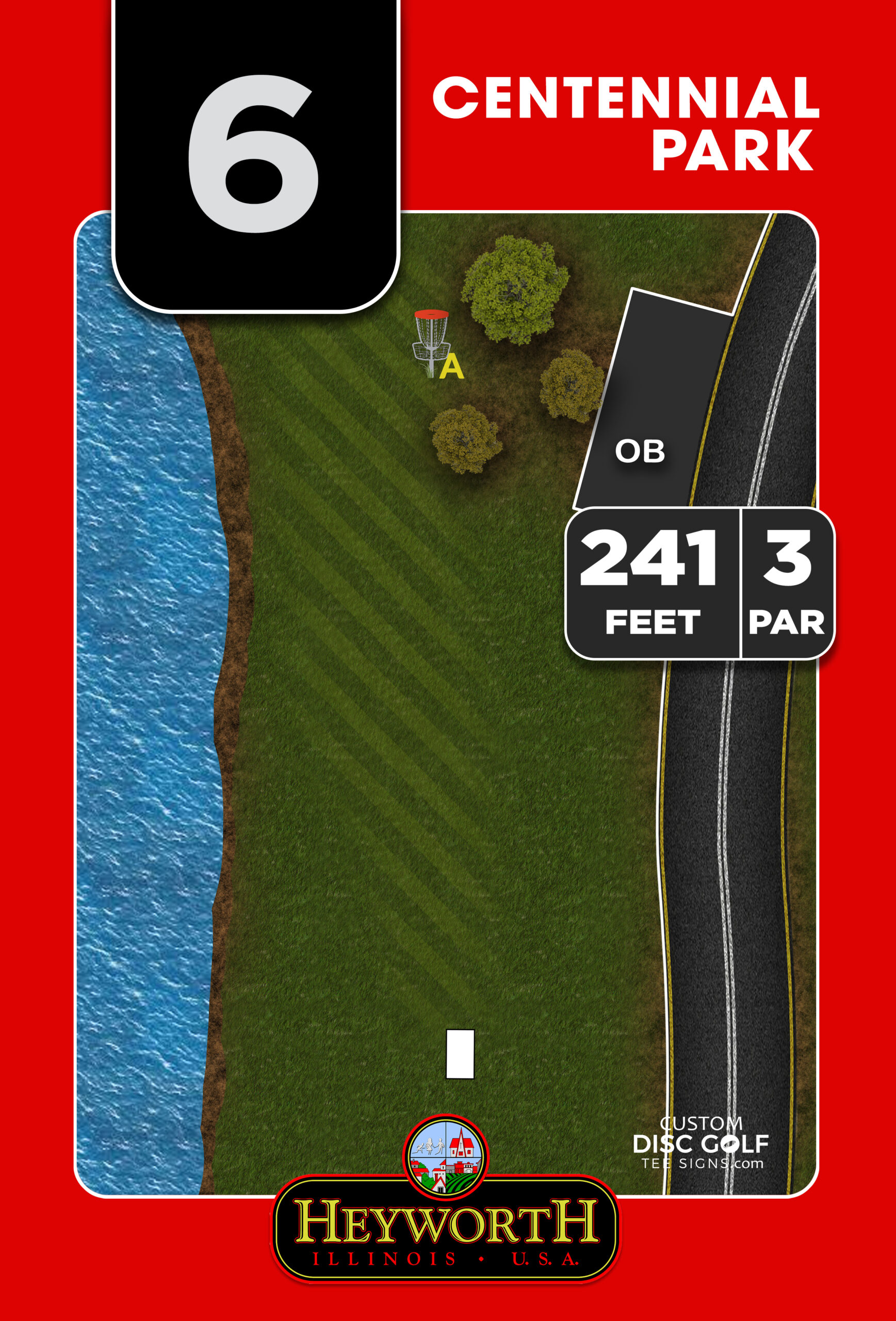
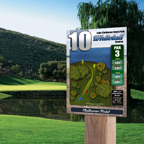
At minimum, each sign should use the same placement and hierarchy for the hole number, par, distance, hole map, and next-tee direction. If your course uses multiple tees or basket positions, identify them with a consistent color and label system throughout the entire property. For example, do not call one set of pads “Blue” on Hole 1, “Long” on Hole 5, and “Advanced” on Hole 11 unless those terms are clearly tied together.
The hole map deserves particular attention. It should show the actual fairway shape, wooded lines, water hazards, out-of-bounds areas, mando locations, basket placement, and meaningful landmarks. A generic arrow may technically point toward the basket, but it does not help a player understand a blind dogleg or a landing zone behind a tree line. High-resolution, course-specific layouts make the sign useful rather than decorative.
Keep the visual hierarchy disciplined. The hole number should be easy to identify at a glance. Distances and par should be readable from the tee area. The map needs enough space to communicate strategy without becoming crowded. When every sign follows the same structure, players spend less time decoding the sign and more time playing the hole.
Use One Source of Truth for Course Data
Signage errors usually begin with scattered information. One committee member may have an old scorecard, another may have distances from a course app, and a third may know that a basket moved last season. Before design begins, create one approved course data sheet.
Confirm each hole’s current tee location, basket location, par, measured distance, alternate configurations, hazard rules, and next-tee route. If possible, have the course designer, parks representative, or lead course manager approve this information before artwork goes to proof. This step prevents costly reprints and avoids the frustration of installing beautiful signs with inaccurate distances or outdated layouts.
Create a Design Standard That Works Outdoors
Course signage has to work in bright sun, rain, mud, and fast-paced rounds. That means your design standards should prioritize legibility before decoration. A club logo, city seal, or sponsor panel can strengthen the sign, but they should never compete with the hole information players need most.
Choose a limited color palette that provides strong contrast. Dark text on a light background, or light text on a dark background, can both work when the contrast is clear. Avoid relying only on color to distinguish tee pads or routes. Add labels, symbols, or pattern differences so the information remains understandable for a wide range of players.
Typography should also stay consistent. Use the same typefaces, number treatment, icons, and spacing across the system. A player may not consciously notice those details, but they will feel the difference between a coordinated course and a collection of unrelated signs.
Branding can be incorporated with purpose. Municipal courses may need city or parks department identification. Club-managed courses may want a course logo and contact information. Tournament-level facilities may want a more distinctive visual identity. The right approach depends on the property, but the core information should remain consistent no matter which branding elements are included.
Standardize Navigation Beyond the Tee Pad
Even excellent tee signs cannot solve a course that is hard to follow between holes. Directional signage is especially valuable where paths cross, the next tee is not visible, or multiple loops begin from the same area.
Use the same arrows, colors, and sign shapes everywhere. If a small arrow marker directs players to the next hole, keep it in the same general placement and at a predictable height throughout the course. At complicated transitions, include the next hole number instead of assuming an arrow alone is enough.
A course overview sign near the parking area or first tee should reinforce the same system. It can show the overall layout, parking, restrooms, practice areas, emergency access points, rules, and key amenities. For public courses, this is often the sign that sets expectations before a player throws a disc.
There is a trade-off to consider. Too few directional signs leave new players frustrated; too many can clutter a natural setting. The answer is not more signage everywhere. It is placing clear signs at the points where players are most likely to make a wrong turn.
Choose Materials for the Real Conditions of Your Course
A standardized sign program should be built for long-term use, not just installation day. Material selection depends on climate, exposure, mounting method, and budget, but outdoor durability should be part of the decision from the start.
UV-protected full-color printing helps protect maps, colors, and sponsor artwork from sun exposure. Aluminum composite is a popular choice for durable, professional tee signage, while aluminum may be the better fit for projects that need a different level of strength or finish. The important point is to select one material approach that can be repeated as signs are added or replaced.
Standardize sign dimensions and mounting hardware as well. When every tee sign uses the same footprint, post spacing, and installation method, maintenance becomes far simpler. If a sign is damaged, your team can replace it without redesigning the mount or improvising a new solution on site.
Build Sponsorship Into the System, Not as an Afterthought
Sponsorship can help clubs, parks departments, and community projects fund better signage, but it needs a defined format. Randomly placing sponsor logos wherever space is available can make a course look crowded and inconsistent.
Create a dedicated sponsor area on every applicable sign. Keep its size, placement, and logo rules consistent. A sponsor panel at the bottom of each tee sign, for example, can provide visibility without interfering with hole maps or scoring information. You can also offer larger sponsor placement on course maps, entry signs, or specific amenities when that matches the project’s funding structure.
Set expectations before approaching local businesses. Explain the number of signs, expected visibility, logo specifications, sponsor term, and any renewal process. A polished, standardized package is easier to present to sponsors because it shows that the project is organized and professionally managed.
Use a Proofing Process Before Production
The final safeguard is a structured proofing process. Review the complete sign family together, not only individual signs in isolation. Seeing the full set makes it easier to catch inconsistencies in colors, distances, legends, sponsor placement, and course branding.
Ask the people who know the course best to review the proofs, but limit final approval to a clear decision-making group. Too many uncoordinated reviewers can slow a project and introduce conflicting changes. A parks representative, course manager, club lead, and designer can usually provide the right balance of operational knowledge and accountability.
Custom Disc Golf Tee Signs helps organizations move through this process with course-specific artwork, organized proofs, durable material options, and signage packages built around the needs of the property. The goal is not to force a generic template onto your course. It is to create a repeatable visual system that fits the way your players actually move through it.
A well-standardized sign program makes the course easier to understand on the first visit and easier to maintain for years afterward. Start by walking the player journey, confirm your course data, and make each sign part of one complete system. That is how a signage project becomes a lasting improvement to the course rather than a collection of replacements.