Disc Golf Course Overview Sign Basics
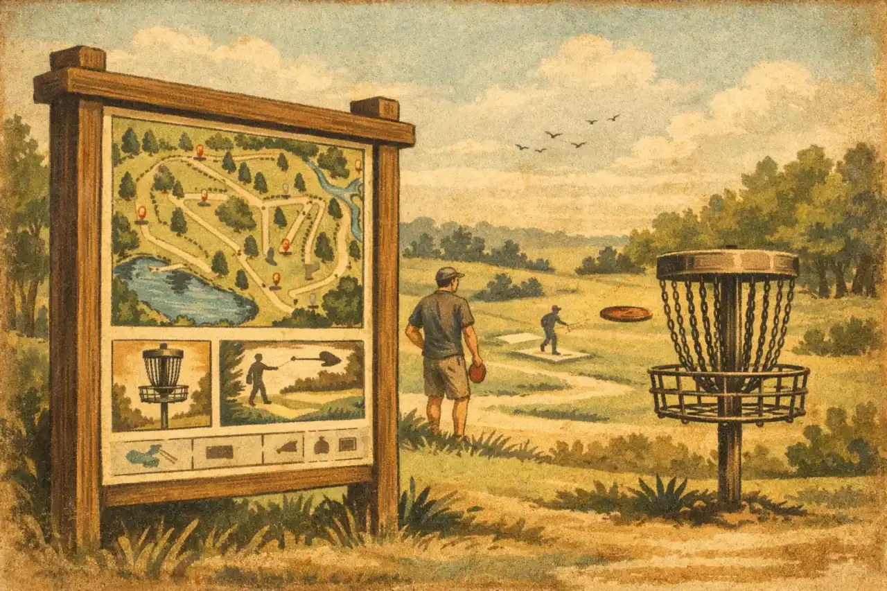
The first thing players look for at a new course is not the first tee pad. It is orientation. A well-designed disc golf course overview sign gives players a clear starting point, shows them how the course flows, and sets expectations before they ever throw a shot. For clubs, park departments, and course managers, that single sign often does more work than any other piece of on-course signage.
If your course has strong baskets and solid tee signs but no central overview, players end up piecing the layout together on their own. That creates confusion, slows pace of play, and makes the course feel less polished than it really is. A good overview sign solves those problems fast, while also giving your facility a more professional presentation.
Why a disc golf course overview sign matters
An overview sign is the welcome point for the entire course. It tells first-time visitors where they are, where they should begin, and what kind of layout they are about to play. That seems simple, but it has a direct effect on player experience, event readiness, and even course reputation.
When players arrive at a public course, they often have only a few seconds to understand the site. If parking, the practice basket, hole 1, restrooms, and walking paths are not obvious, frustration starts early. That is especially true at multi-use parks, wooded properties, or courses with crossing fairways and alternate pin placements. A course overview sign reduces that friction by making the full layout visible at a glance.
It also helps different types of users. New players need reassurance that they are in the right place. Tournament players want layout accuracy. Park staff want fewer directional questions. Sponsors want visible placement on something players actually stop to read. A strong overview sign supports all of those goals at once.
What should be on a disc golf course overview sign
The best signs balance clarity with detail. Too little information and the sign becomes decorative. Too much and it turns into a crowded map that nobody reads. The right content depends on the complexity of the course, but several elements consistently matter.
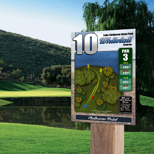
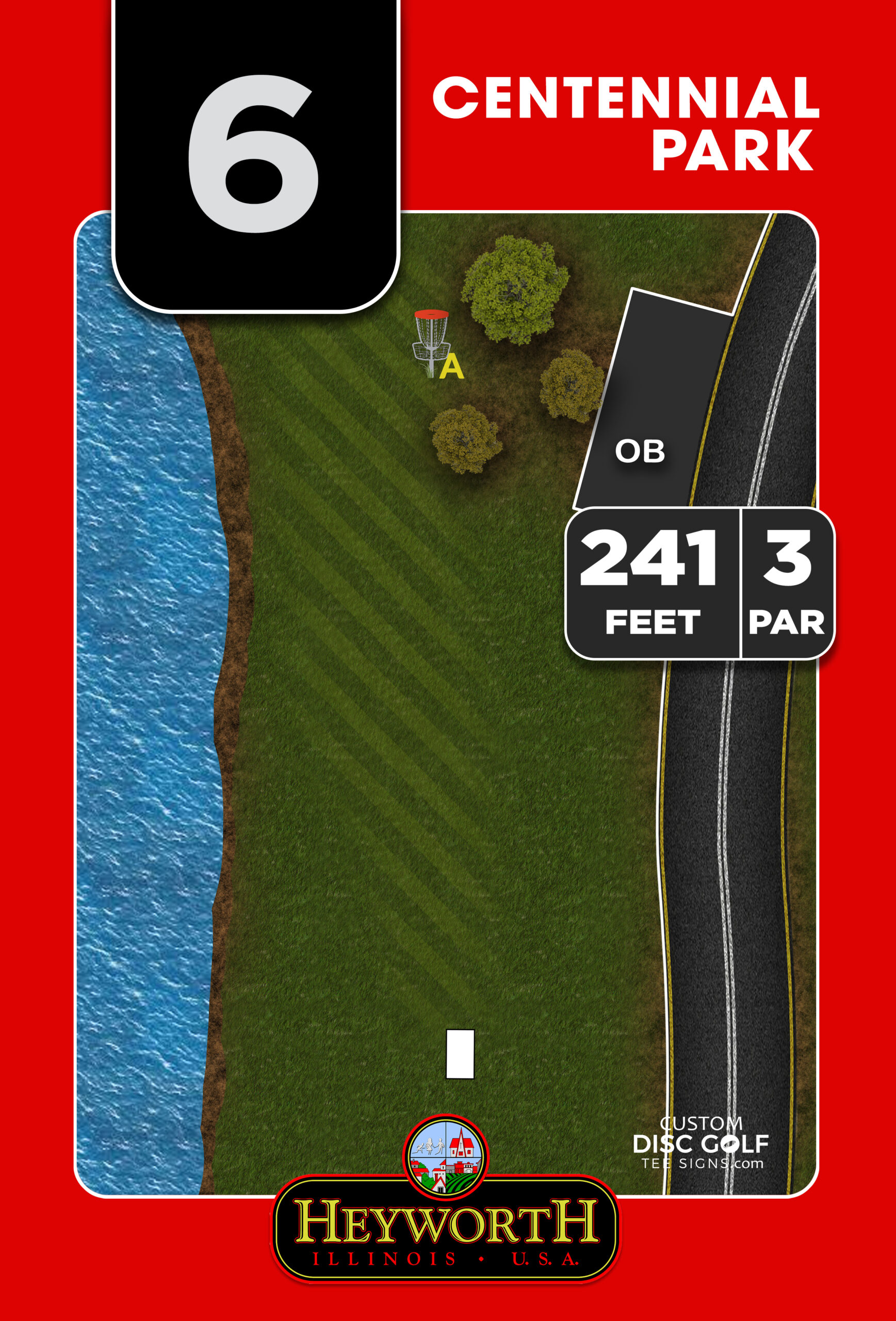
A readable full-course map
The map is the center of the sign. It should show hole sequence, tee and basket locations, walking paths, parking, and the player starting point. If the course has long and short tees, multiple pin positions, or split loops, those need to be shown in a way that is easy to understand from standing distance, not just close inspection.
This is where disc-golf-specific design matters. A general sign shop may produce a map, but a sign built by people who understand course flow tends to be more practical. They know players need to quickly distinguish fairways, transitions, and amenities without studying the sign for five minutes.
Course identity and branding
A course overview sign is also your front-facing presentation. Course name, park name, logos, and colors help establish identity and consistency with the rest of the signage system. For municipalities and parks departments, that polished branding reflects well on the property. For clubs, it helps the course feel established and cared for.
If you are replacing older signs over time, the overview sign often becomes the visual standard for the rest of the project.
Rules, etiquette, and safety notes
Not every course needs a long rules panel, but most benefit from a few clear reminders. Park hours, course etiquette, out-of-bounds notes, and shared-use warnings can prevent common issues before they start. If a trail crosses multiple fairways or the course shares space with pedestrians, the overview sign is the right place to communicate that.
The trade-off is space. If your course map is complex, keep rules brief and focused. If the layout is simple, you may have room for more operational information.
Sponsorship space
For many public and club-led projects, sponsorships are not an extra. They are what make signage financially possible. A course overview sign offers premium sponsor visibility because nearly every player sees it. That makes it one of the most valuable assets in a signage package.
Well-planned sponsor placement can offset project cost without cluttering the map. The key is integrating sponsor logos into the layout from the beginning rather than forcing them into leftover space after the design is done.
Design choices that affect real-world performance
A sign can look great on a screen and still fail on the course. The difference usually comes down to layout discipline, material choice, and installation planning.
Legibility from a standing distance
Players are not reading this sign at a desk. They are outside, often in glare, sometimes in a hurry, and usually standing several feet away. Fonts need to be large enough to read comfortably. Colors need contrast. The map cannot rely on tiny labels and thin lines.
This is one reason custom design outperforms generic templates. Every course has different terrain, different routing, and different priorities. A dense wooded 18-hole layout needs a different graphic approach than an open park course with long sightlines.
Durable materials for public use
Outdoor signs live hard lives. Sun exposure, moisture, wind, temperature swings, and public wear all take a toll. Materials matter. For most course applications, durable substrates such as aluminum composite or aluminum make sense because they hold color well, resist weather, and support long-term use.
UV protection is not a small detail either. Full-color graphics need to stay readable over time, not look faded after one hot season. If your course is investing in a new sign system, replacing low-grade materials later usually costs more than choosing the right substrate at the start.
Sign size and mounting location
Bigger is not always better. The right size depends on how much information the sign needs to carry and how far away it will be viewed. A compact beginner course may need a simpler panel than a championship layout with multiple tee positions and longer transitions.
Placement matters just as much. The overview sign should be near parking or the primary arrival point, with a clear line of sight and enough room for small groups to gather around it. If players have to hunt for the sign, it is not doing its job.
Common mistakes to avoid
The most common problem is treating the overview sign like an afterthought. Courses will invest in baskets, pads, and individual tee signs, then rush the main sign at the end. That usually leads to cluttered maps, weak branding, and missed sponsor opportunities.
Another issue is relying on low-resolution course art. If the base layout is not drawn clearly, no amount of printing quality will fix it. Clean, high-resolution artwork matters because it affects how professional and usable the final sign will be.
Some projects also underestimate stakeholder input. Clubs, parks staff, and volunteers often have different priorities. One group wants sponsor visibility, another wants park branding, and another wants every alternate layout shown. The best workflow organizes those decisions early, with proofing built into the process so the final sign is accurate before production.
When a custom overview sign is worth it
If your course is temporary, lightly used, or still changing layout every few months, a basic stopgap sign may be enough for now. But once the course has an established footprint, regular traffic, or tournament ambitions, a custom overview sign becomes a practical investment.
It improves navigation immediately. It reduces confusion for visiting players. It gives local government and parks leadership a more professional asset to point to. It creates a sponsor-ready display area. Most importantly, it helps bring the whole course to a higher standard instead of leaving players to figure things out hole by hole.
That is why many organizations choose to build the overview sign as part of a coordinated signage package rather than as a one-off piece. When the main map, tee signs, and branding all work together, the course feels organized and intentional from the first impression onward.
For clubs, municipalities, and organizers planning a signage upgrade, the smartest approach is to think beyond just printing a map. A successful disc golf course overview sign combines accurate layout design, durable materials, sponsor planning, and a proofing process that catches issues before the sign goes into production. That is the difference between a sign that simply exists and one that genuinely improves the course every day it stands there.
If your players still arrive asking where hole 1 is, your overview sign has not been given enough attention yet.