How to Design Accessible Tee Signage for Courses
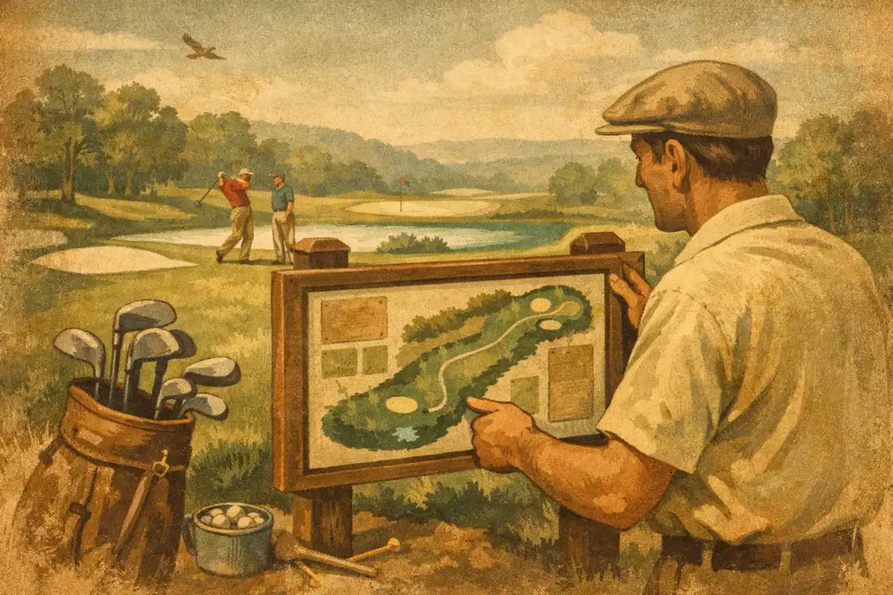
A player should be able to step onto the tee, look once, and understand the hole. That is the standard when you design accessible tee signage for a disc golf course. It is not simply about making signs look polished. It is about giving new players, tournament visitors, families, and experienced locals the information they need without guesswork.
Accessible tee signage supports a better round from the first drive. It reduces wrong fairways, pace-of-play delays, frustrated first-time visitors, and the repeated question every course manager hears: “Where do we throw from here?” Done well, it also gives your course a more professional, maintained appearance – a meaningful advantage for municipal parks, private facilities, clubs, and community-led improvement projects.
Accessibility Starts With Clear Hole Information
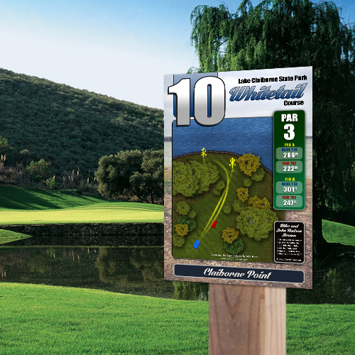
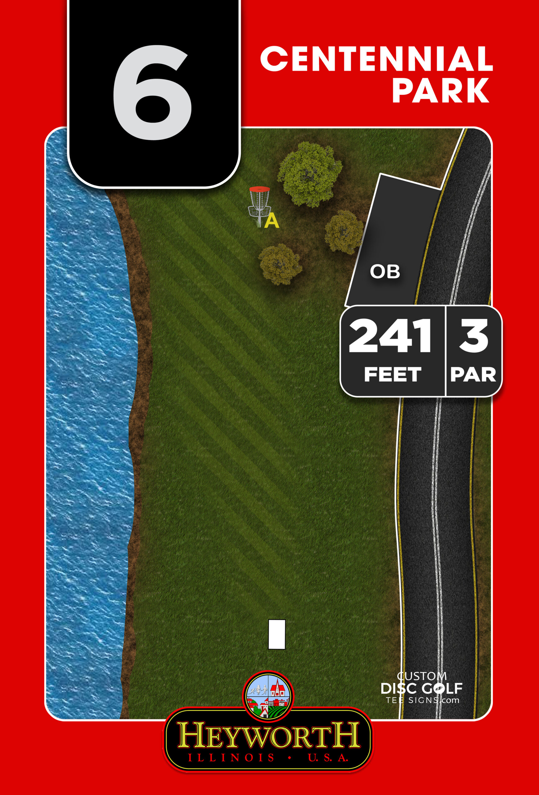
A tee sign has a job to do in a short amount of time. Players need to identify the hole number, par, distance, basket location, tee locations, key obstacles, and the intended route to the green. If those details compete with decorative backgrounds, oversized logos, or tiny labels, the sign may look busy without being useful.
Start with information hierarchy. Hole number and par should be the quickest elements to find. Distance should be close behind. The map is the center of the sign, and it should show the fairway in a way that matches what players see from the tee. A simple, accurate layout is more valuable than an artistic map that leaves room for interpretation.
For courses with multiple tee pads or pin positions, use a consistent system. Match each tee and basket position to clearly labeled colors, symbols, or both. Color is helpful, but it should not carry the entire meaning. A player with limited color perception should still be able to distinguish a long tee from a short tee or an A pin from a B pin through labels and shapes.
Design Accessible Tee Signage With Readable Type
Typography is one of the most overlooked parts of course signage. A font may look great on a laptop screen but become difficult to read outdoors from several feet away. Players are often standing in bright sun, rain, or low evening light. They may be carrying discs, checking a scorecard, and trying to keep their group moving.
Use clean, familiar sans-serif typefaces and give important text enough size to be read at normal viewing distance. Avoid condensed fonts, decorative scripts, and all-capital blocks of small text. Uppercase lettering can work for short labels, but mixed-case text is easier to scan for longer instructions and notes.
Contrast matters just as much as type size. Dark lettering on a light background, or light lettering on a very dark background, generally performs best. A pale gray label over a satellite-style course image may be technically visible in a design file, yet nearly disappear in direct sunlight. The same issue occurs when dark green type sits on a green fairway illustration.
A practical test is simple: print the sign layout at a reduced scale or view a proof from several feet away. If a volunteer who did not help create the design cannot quickly identify the par, distance, and next target, simplify the layout before production.
Keep Essential Instructions Short
Some holes need guidance beyond the map. A mandatory route, out-of-bounds area, drop zone, protected habitat boundary, or safety concern may require an instructional note. Keep that wording direct. “Mandatory left of marked tree” is easier to process than a paragraph explaining the hole’s history and intended play.
If a hole requires several rules or local details, the tee sign should present the essentials first. Additional information can be provided elsewhere, such as on a course overview sign, tournament board, or supplemental digital resource. A QR code can be useful for expanded content, but it should never replace the core information players need at the tee.
Maps Should Explain the Shot, Not Just Decorate the Sign
A high-quality hole map gives players confidence before they throw. It should show the tee position, fairway shape, basket location, water, major trees or rough, elevation cues when relevant, and meaningful hazards. It should also orient the player correctly. If north is included, use it consistently. If the map is drawn from the tee perspective, make that clear through the layout.
The best approach depends on the hole. A wide-open park hole may only need a clean fairway diagram and distance. A wooded par four with crossing trails, alternate pin placements, and a creek needs more detail. The trade-off is clarity: adding every tree, bench, and minor feature can turn a useful map into visual noise.
Use recognizable landmarks selectively. A creek, road, pavilion, dense tree line, or distinct elevation change can help players confirm they are reading the hole correctly. For wooded courses, showing the intended landing zone and the next fairway segment is often more valuable than trying to illustrate every gap.
Course managers should also plan for change. If baskets move regularly or the property is still evolving, consider a sign system that can accommodate updates without requiring a full replacement. Fixed, permanent hole information belongs in the printed design. Details that are likely to change should be handled with a clearly designed update area or a replacement plan built into the project budget.
Physical Placement Is Part of Accessible Signage
Even the best tee sign cannot help players if it is hidden, angled poorly, or blocked by vegetation. Sign placement should be considered during the course walk-through, not after the signs arrive.
Place the sign where a player naturally pauses before throwing, typically near the back or side of the tee pad. Avoid positioning it directly in a player’s throwing line or where a crowd will block access. The sign face should be easy to approach and read without standing in mud, tall grass, or an uneven drainage area.
Mounting height also affects usability. A sign that is too low forces players to bend down. A sign that is too high can be hard to read, especially for younger players and wheelchair users. Local accessibility requirements and site conditions should guide final installation decisions. If your project is intended to meet ADA-related standards, work with the appropriate parks department, facilities professional, or accessibility specialist. Sign design can support accessibility, but compliance depends on the full site, including routes, surfaces, reach ranges, and installation details.
Glare is another practical issue. Glossy surfaces, poor angle selection, and direct afternoon sun can make maps difficult to read. Durable UV-protected sign materials help preserve color and legibility over time, while thoughtful placement helps players see the information when it matters.
Build a Consistent System Across the Course
Accessibility improves when every sign follows the same logic. Hole numbers appear in the same place. Distances use the same units and visual treatment. Tee colors, pin labels, hazard symbols, and sponsor areas remain consistent from hole 1 through hole 18.
That consistency is especially valuable on public courses where visitors may not know local shorthand. A first-time player should not have to decode a different sign style on every hole. It also helps clubs and park staff maintain the system over time when a sign needs to be updated or replaced.
A complete signage plan often includes more than tee signs. Course overview signs can establish rules, parking, practice areas, restrooms, emergency information, and the first-tee route. Directional signs can guide players between holes where the path is unclear. Together, these elements remove friction from the full course experience rather than leaving tee signs to solve every navigation problem.
Make Sponsorship Useful, Not Distracting
Sponsorship can make a signage project attainable for clubs, municipalities, and volunteer-led groups. It can offset production costs while giving local businesses a visible connection to a valued community asset. But sponsor placement needs boundaries.
Give sponsors a defined, consistent area that does not compete with hole data or the map. A well-designed sponsor panel feels intentional and professional. Logos scattered across the fairway diagram, distances, and safety notes make the sign harder to use and reduce the value of the sponsor investment.
For larger projects, create a sponsor package before outreach begins. Define logo dimensions, artwork requirements, placement, and the duration of recognition. This protects the visual system and gives potential sponsors a clear, credible opportunity to support the course.
Use a Proofing Process That Catches Problems Early
Great course signage comes from accurate information and a disciplined review process. Before artwork begins, gather current hole distances, par, tee and basket locations, course rules, sponsor assets, brand colors, and any changes planned for the near future. A site visit, aerial reference, and input from the people who know the course best all improve accuracy.
Then review proofs with more than one perspective. Course designers can confirm intended play. Parks staff can flag operational or safety concerns. Club representatives can catch local details that visitors may miss. Ask reviewers to focus on whether the sign can be used quickly, not only whether it looks good on screen.
Custom Disc Golf Tee Signs works from course-specific information and proofs because the best signs are built around how your course actually plays. That process helps turn scattered notes, distances, and sponsor files into a coordinated sign system that is ready for production and installation.
Accessible tee signage is a practical investment in every player’s experience. When the map is clear, the text is readable, the materials hold up, and the sign is placed where players need it, your course feels easier to navigate and more prepared to welcome the next group to the tee.