Best Disc Golf Course Kiosks That Work
A kiosk usually gets judged in the first ten seconds. Players walk up, glance at the map, check the layout, maybe look for league info or local rules, and move on. If the sign is cluttered, weathered, or missing key details, the course feels harder to use before a disc is ever thrown. That is why the best disc golf course kiosks do more than fill space at hole 1 – they set the tone for the entire facility.
For course managers, clubs, and park departments, a kiosk is one of the highest-visibility pieces of infrastructure on the property. It helps first-time players find their way, reinforces the course brand, creates room for sponsors, and reduces confusion that leads to slow play and unnecessary wear on the park. A good kiosk is not just a large sign. It is a course communication system placed where players actually need it.
What the best disc golf course kiosks need to do
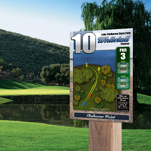
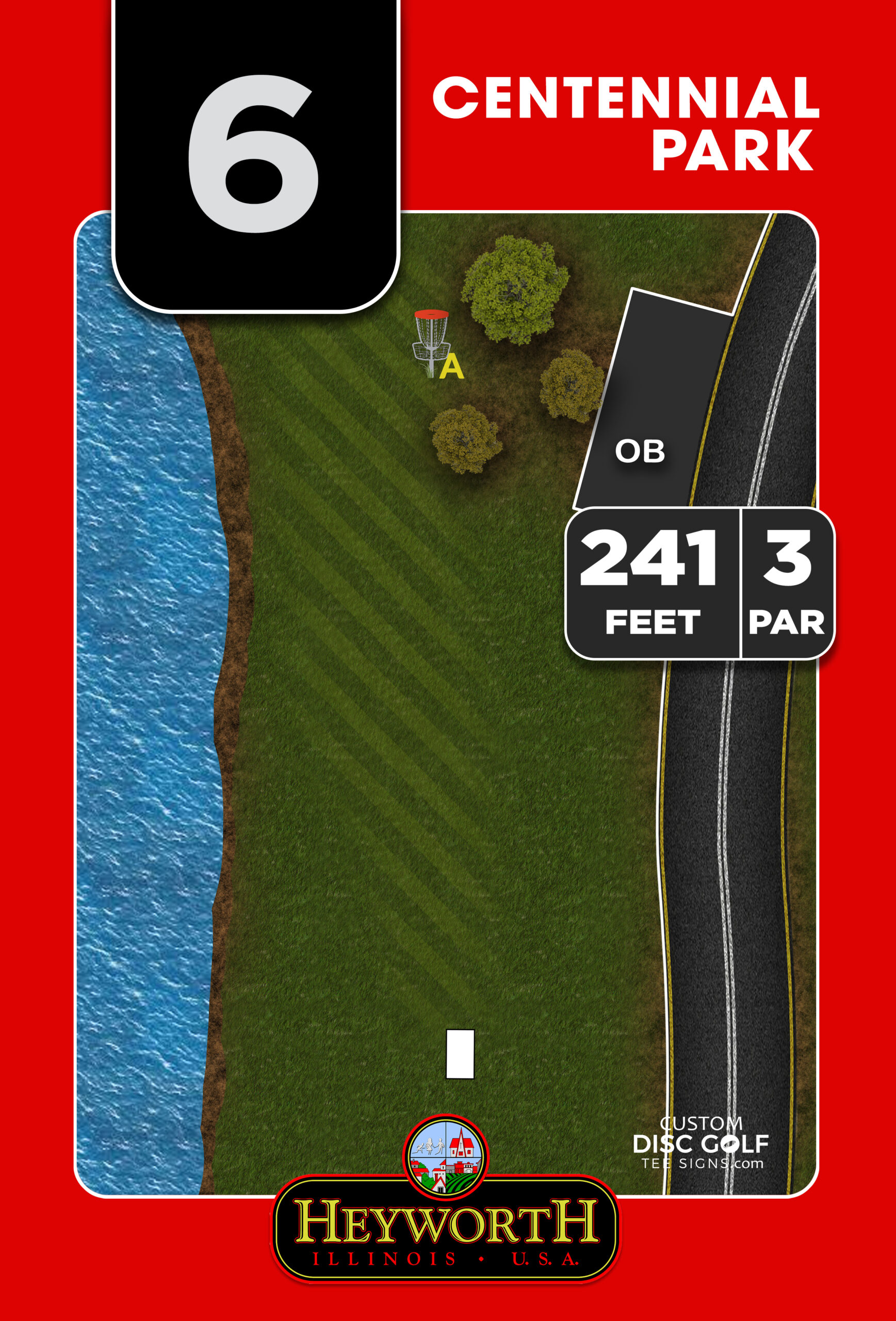
The best kiosks are clear before they are clever. Players should be able to understand where they are, how the course flows, and what they need to know without standing there for several minutes decoding the layout. That usually starts with a clean, accurate course map that shows tee locations, basket positions when relevant, walking paths, parking, practice areas, restrooms, and any places where the course crosses roads, trails, or other park uses.
That sounds simple, but this is where many kiosks fall short. A map pulled from an old sketch, low-resolution artwork, or a generic layout style can make even a strong course feel disorganized. The best installations use custom map design that reflects the actual course footprint and presents information in a way players can read quickly from a standing distance.
A strong kiosk also handles the basics that players ask about every day. Is the course pay-to-play or free? Are there out-of-bounds rules that apply across the property? Where should new players start? Is there a lost disc contact? Are there league nights, tournament dates, or QR-ready areas for future updates if the park wants them? A kiosk should answer recurring questions so staff, volunteers, and local players do less explaining.
Best disc golf course kiosks start with map clarity
If there is one feature that separates effective kiosks from forgettable ones, it is map clarity. The map is the center of the sign, and everything else should support it rather than compete with it.
A clear map uses contrast well, labels key landmarks, and shows movement through the course in a logical way. Players should be able to identify hole 1 immediately and follow the full routing without guessing where transitions happen. If the course has multiple loops, alternate tees, temporary basket settings, or overlapping fairways, the design needs even more care. Trying to cram every possible detail into one layout often makes the sign harder to use, not better.
This is where course-specific design matters. A beginner-friendly 9-hole course in a city park does not need the same kiosk structure as a championship layout with practice areas, warm-up zones, tournament traffic, and heavy sponsor involvement. The best disc golf course kiosks are built around the actual needs of the property, not a one-size-fits-all template.
Materials matter more than most buyers expect
A kiosk can look great in a proof and still disappoint in the field if the material choice is wrong. Public-facing course signage deals with sun, rain, snow, irrigation, heat, humidity, and the occasional impact from equipment or vandalism. That is why durability should be part of the planning stage, not an afterthought.
For most courses, aluminum composite and aluminum are strong options because they hold color well, stand up to outdoor exposure, and create a more professional finished look than lower-end substrates. UV protection matters too. A beautifully designed map loses value quickly if the colors fade and the text becomes difficult to read after a short time in the sun.
There is also a practical budget conversation here. Not every course needs the premium material package, but cutting too far down on durability usually costs more later when replacement becomes necessary. Municipal buyers and volunteer-led projects often do best when they balance upfront cost with long-term maintenance savings. A kiosk that lasts and stays readable is usually the better value.
The right content mix keeps the sign useful
The most effective kiosks do not try to become bulletin boards for everything. They focus on the information that deserves a permanent, polished place.
A course map should lead. After that, most courses benefit from a concise welcome section, park or course rules, safety notes, and a visible area for sponsors or supporters. If the course depends on donations, volunteer workdays, or club coordination, the kiosk can also provide a clean area for that information. The key is hierarchy. Players should notice the essential information first and the secondary information second.
Sponsor placement deserves special attention because it can help fund the project without making the sign feel overly commercial. Done well, sponsor logos add credibility and offset costs for clubs, parks, and community projects. Done poorly, they overwhelm the map and distract from the player experience. Good layout solves that. Sponsors need visibility, but the course itself must stay at the center.
Kiosk design should match the course standard
When a course installs quality tee signs but leaves the main kiosk looking temporary or outdated, the experience feels inconsistent. The entry sign, course overview, and tee signage should feel like part of the same system. That consistency tells players the course is organized and cared for.
This matters even more for parks that host events, attract traveling players, or want to strengthen local support. A polished kiosk helps present the course as a legitimate recreational asset rather than an informal layout with improvised signage. For park departments and municipalities, that visual standard can support broader goals around public use, tourism, and park improvement.
Custom Disc Golf Tee Signs works in this space because course infrastructure is not generic. A kiosk has to coordinate with tee signs, branding, map artwork, sponsor areas, and material choices across the whole property. When those parts are designed together, the result feels intentional and performs better in the field.
Installation and upkeep are part of the buying decision
The best disc golf course kiosks are not only well designed. They are practical to install and maintain. That means thinking about panel size, mounting method, readability at the intended height, and how the sign will hold up over time in that specific location.
A large panel may offer more room for content, but it also needs a stable structure and enough open space for viewers to step back and read it. A smaller kiosk might fit the site better, especially on compact courses or where park traffic patterns are tight. There is no universal right size. The better question is what players need at that location and how the structure will perform in the real environment.
Maintenance matters too. If updates are likely, such as revised local rules or sponsor changes, plan for that early. Some elements should be permanent. Others may need an easier path for future refreshes. Buyers who think through this upfront avoid the common problem of a kiosk becoming outdated while the rest of the course improves around it.
How to choose among the best disc golf course kiosks
Start with the course goals, not the sign dimensions. If the primary need is navigation for first-time players, map quality and routing clarity should drive the project. If the course is trying to elevate its public image, support tournaments, or attract sponsorships, branding and presentation may matter just as much as navigation. If the project is grant-funded or volunteer-led, durability and design efficiency may be the priorities.
It also helps to think in systems. The kiosk should work with tee signs, next-tee guidance, and the overall look of the course. A strong course entrance paired with weak hole signage creates frustration. High-quality tee signs with no useful overview map create confusion. The best outcomes come from treating the kiosk as one piece of the full player experience.
And yes, budget matters. But the right comparison is not simply cheapest versus most expensive. It is whether the kiosk solves the problems the course actually has. A lower-cost sign that still leaves players confused is not a bargain. A well-designed, durable kiosk that improves navigation, supports sponsors, and raises the course standard tends to justify itself quickly.
A good kiosk gives players confidence before the round starts. If you are planning course improvements, that is a smart place to invest – not because it is flashy, but because it makes the whole property easier to understand and easier to respect.