How to Create Disc Golf Sponsor Panels

If you need to create disc golf sponsor panels, the goal is not just to add logos wherever they fit. A good panel should help fund the course, look like it belongs on the sign, and give local businesses a placement they are proud to support. When sponsor space feels like an afterthought, the whole sign suffers. When it is planned correctly, it strengthens both the design and the budget.
For most clubs, parks, and course managers, sponsor panels sit at the intersection of fundraising and presentation. They need to be visible enough to deliver value, but not so dominant that they crowd out the hole map, par, distance, and navigation details players rely on. That balance is what separates a professional course sign package from a patchwork upgrade.
Why create disc golf sponsor panels carefully
Sponsor panels can offset a meaningful share of a signage project. On some courses, they make the difference between postponing improvements and moving forward with a full sign rollout. That said, not every sponsor placement creates the same result.
A panel that is too small makes sponsors feel buried. A panel that is too large can make the tee sign look like an ad board. A panel placed without design structure often creates visual clutter, especially when multiple businesses submit logos with different shapes, colors, and file quality.
This is why sponsor panel planning should happen before final artwork begins, not after. Once the hole layout, branding, and information hierarchy are established, sponsor space can be built into the sign in a way that feels intentional. That leads to a cleaner proofing process and a stronger final product.
Start with the sign’s main job
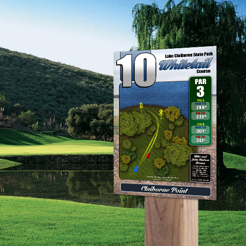
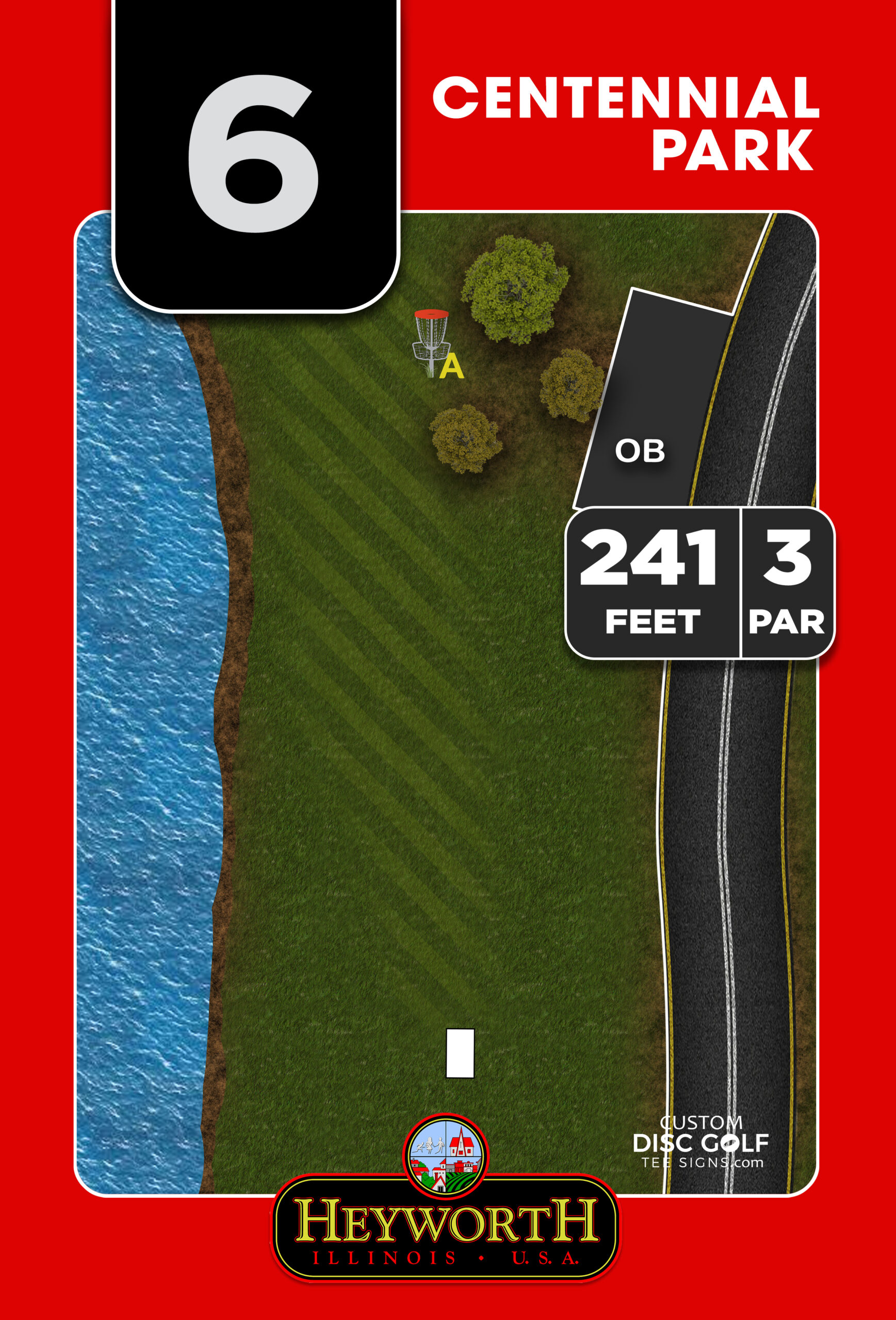
Before you size or place any sponsor area, define what the sign must do for players on the tee. A disc golf tee sign is primarily an information tool. Players need to understand the hole layout, direction of play, distance, par, and any major hazards or out-of-bounds areas. If the sign does not communicate clearly, the course experience suffers no matter how much sponsor revenue it brought in.
That means sponsor panels should support the sign system, not compete with it. In most cases, the map and hole data deserve the most prominent space. The sponsor area should be designed around that core function, with enough consistency that every hole feels part of the same package.
This is also where material and sign size matter. A larger premium sign gives you more flexibility for sponsor placement without compromising readability. A smaller sign can still include sponsorships, but the layout has to be more disciplined. Trying to force too many logos into a compact design usually creates more problems than value.
Choose a sponsor panel structure that fits your course
There is no single right format for every project. The best structure depends on how many sponsors you have, how much funding you need to raise, and how polished you want the full sign system to look.
Single-sponsor panels work well when each hole has an individual business sponsor. This approach gives strong visibility and is easy to sell because the sponsor knows exactly where its logo will appear. It also keeps the layout simple. The trade-off is consistency. If every hole has a different sponsor logo style, the sign package can feel less unified unless the panel area is tightly controlled.
Multi-sponsor panels are useful when you need to recognize several contributors on each sign or across a course map. These can work well if the logos are scaled uniformly and placed within a consistent branded frame. The challenge is density. As more logos are added, each one becomes less legible from normal viewing distance.
A tiered approach often works best for public courses and club-led projects. For example, primary sponsors may receive tee sign placement, while supporting sponsors appear on the course map, kiosk, or donor board. This creates better fundraising flexibility without overloading every individual tee sign.
Design sponsor panels for readability, not just placement
The biggest mistake in sponsor panel design is assuming any logo file can just be dropped into the layout. In reality, sponsor logos come in every shape, proportion, and quality level. Some are horizontal. Some are stacked. Some rely on light colors that disappear on certain backgrounds. Some arrive as screenshots instead of print-ready artwork.
To create disc golf sponsor panels that look professional, you need a system. Start by assigning a fixed sponsor zone on the sign. That zone should have consistent dimensions, margin spacing, and background treatment from hole to hole. Once that framework is set, individual logos can be adjusted within it while keeping the overall package clean.
Background choice matters more than many organizers expect. A white or light neutral sponsor area usually gives the best flexibility because it supports the widest range of logos. Dark backgrounds can look sharp, but they often require logo inversion or special preparation that some sponsors cannot provide. If you are managing multiple local businesses, simplicity tends to win.
You also want enough breathing room around each logo. Tight spacing makes the panel feel cheap, even on a high-quality substrate. Good sponsor presentation comes from alignment, margin control, and scale discipline. That is where professional sign design earns its keep.
Set sponsor expectations early
A well-run sponsor program is easier to design because expectations are clear from the beginning. Before collecting logos, define what each sponsor receives. Will they appear on one hole, several holes, every tee sign, or only a kiosk panel? What file types do you need? Are taglines included, or logo only? Will logos be printed in full color as submitted, or can they be simplified if needed for legibility?
These details prevent delays during proofing. They also help avoid awkward conversations later when one business expects a large placement but paid the same amount as a smaller supporting sponsor.
It helps to think of sponsor panels as inventory. The more clearly you define the available placements, the easier it is to sell them. A structured sponsor plan also gives municipalities, park departments, and volunteer committees something concrete to review before approvals are needed.
Keep sponsor panels consistent across the course
Consistency is one of the fastest ways to raise the perceived quality of a course. Even if your signs include different maps, different hole lengths, and different sponsor logos, the system should still feel coordinated.
That usually means using the same sponsor panel location on every sign, the same border or framing style, and the same sizing rules for logos. If one hole has a logo stretched across the bottom and the next has three tiny logos squeezed into a corner, the course starts to look unmanaged.
This matters for more than aesthetics. A consistent sign family helps players process information faster. It also reflects well on the course, the club, and the sponsoring businesses. Local companies are much more likely to renew support when their branding appears in a polished environment.
Think beyond the tee sign
If you have strong sponsor interest, you do not need to force every recognition opportunity onto the tee sign itself. In many cases, the best sponsor strategy includes multiple sign types.
A course overview sign or kiosk can carry broader sponsor recognition without affecting hole-by-hole readability. Directional signs, welcome boards, and event signage can also play a role depending on the project. This gives you more room to create sponsor value while protecting the core function of the tee signs.
For larger courses or phased upgrades, this can be especially useful. You may decide that tee signs feature one sponsor panel per hole, while a central course map includes a larger community sponsor section. That approach keeps individual signs clean and still creates room for broader fundraising.
Use a proofing process that catches problems early
Sponsor-heavy sign packages benefit from a structured review process. It is much easier to fix logo placement, spelling, or hierarchy issues in the proof stage than after production. This is especially true when several stakeholders are involved, such as clubs, parks staff, committees, and sponsors.
A strong proof should show exactly how the sponsor panel sits within the full sign layout, not just the logo by itself. That lets everyone assess balance, readability, and brand visibility in context. It also helps decision-makers catch practical issues, such as a sponsor panel covering map detail or conflicting with a custom-shaped sign edge.
At Custom Disc Golf Tee Signs, this is one reason a disc-golf-specific design workflow matters. Sponsor placement is not treated as a generic add-on. It is built into the overall sign system so the finished product looks cohesive, durable, and course-ready.
What makes a sponsor panel worth paying for
Sponsors are not only buying exposure. They are buying association with a course that looks organized and respected. If the signage feels temporary, crowded, or inconsistent, sponsor value drops. If the signage looks permanent and well designed, the same logo placement carries more weight.
That is why material quality matters alongside design. A full-color sponsor panel printed on durable, UV-protected signage performs better over time and reflects better on everyone involved. Faded graphics and worn surfaces do not just affect the course image. They affect sponsor confidence.
When you approach sponsor panels as part of a complete signage system, fundraising becomes easier. Businesses can see where their support is going, players get clearer signs, and the course presents itself at a higher standard. If you are planning a new sign package or upgrading an older course, build sponsor panels into the design from the start and they will do more than cover costs – they will help the whole project look intentional.