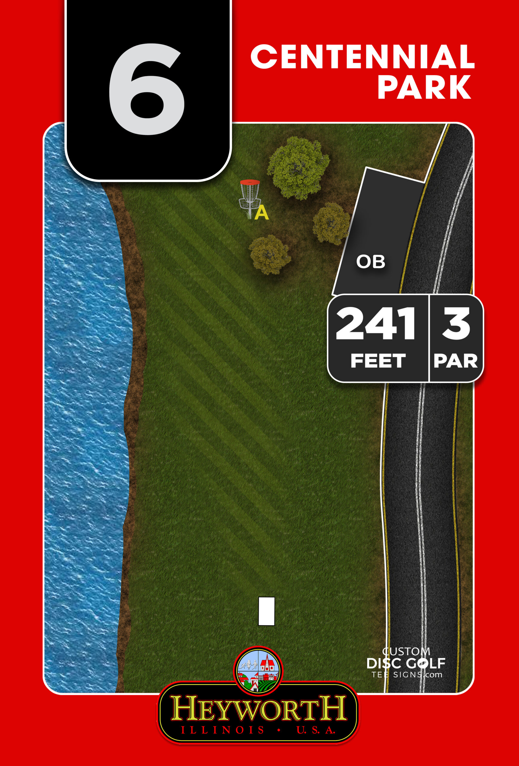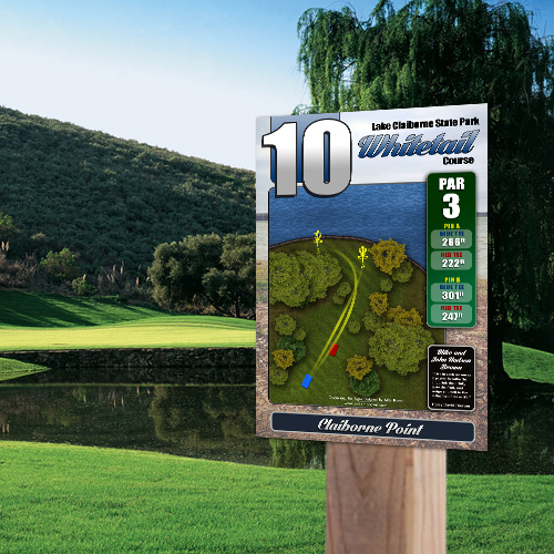
10 Course Entrance Sign Design Ideas
The first thing players see at your course is not Hole 1. It is the entrance. That makes course entrance sign design ideas more than a branding exercise – they set expectations, solve confusion before it starts, and tell players whether the course is organized, current, and worth respecting.
For clubs, parks departments, and course managers, the entrance sign is also where several jobs need to happen at once. It should welcome new players, confirm they are in the right place, introduce the course identity, and give enough information to reduce repeated questions. The best designs do all of that without looking crowded or temporary.
What a Strong Course Entrance Sign Needs to Do
A good entrance sign is not just a larger version of a tee sign. It has a different role. Tee signs help players make decisions hole by hole. Entrance signage needs to orient the player before the round begins.
That usually means balancing four things: visibility from a distance, quick readability up close, durable construction, and a layout that supports how your course actually functions. A heavily wooded park course may need stronger directional cues to parking, practice baskets, and Hole 1. A destination-level course may need more emphasis on branding, rules, and sponsor presentation. A municipal course may need to make room for park standards, logos, or public-use messaging.
The trade-off is simple. The more information you add, the more careful the design needs to be. A sign can be beautiful and still fail if players cannot find the first tee in under 20 seconds.
10 Course Entrance Sign Design Ideas That Work
1. Build the sign around a clear course identity
The strongest entrance signs start with a defined visual identity. That includes the course name, a logo or icon system, and colors that match the tone of the property. A championship-caliber course may lean toward a polished, high-contrast look. A community park course may benefit from a friendly, clean presentation that feels approachable.
This matters because the entrance sign often becomes the visual reference point for everything else on site. If your map board, tee signs, and navigation signs all feel disconnected, the course looks pieced together. When the entrance sign establishes a consistent design language, the entire property feels more professionally managed.
2. Make the course map the centerpiece, not an afterthought
If players gather around the entrance sign, they are usually asking one question: how do I get started? A high-resolution course map should answer that fast. The map should clearly show parking, kiosks, restrooms if available, practice areas, the first tee, and the overall routing.
This is where many signs miss the mark. The map is often too small, too stylized, or buried under decorative elements. A better approach is to treat the map as the core function of the sign and design the rest around it. Attractive branding helps, but orientation is what gets used.
3. Include a simple “You Are Here” marker
A full map is useful. A map with a clear location marker is far better. New players, visiting tournament participants, and park guests who are not familiar with the layout should not have to guess which side of the map they are standing on.
A visible “You Are Here” marker removes hesitation immediately. It is a small design feature, but it changes how fast people can understand the course. This is especially important on larger properties, multi-loop courses, or sites where the entrance is not directly next to Hole 1.
4. Use hierarchy to control what players read first
One of the best course entrance sign design ideas is also one of the most overlooked: control the reading order. Players should see the course name first, then the map or directional cue, then supporting details like rules, contacts, and sponsor placements.
Without that hierarchy, the sign turns into a wall of competing elements. Large bold headings, disciplined spacing, and color contrast make a major difference. This is where professional layout work pays off. Good hierarchy does not just improve appearance – it improves how quickly the sign does its job.
5. Give Hole 1 directions special treatment
Many course signs include a map but still leave first-time players wandering. That usually happens because the route to Hole 1 is too subtle on the layout. If the first tee is not obvious from the entrance, call it out directly with a bold directional arrow, a labeled path, or a separate visual note.
This is particularly valuable on courses where parking lots, walking paths, pavilions, and other park features compete for attention. If players need to stop and ask where the round begins, the sign missed a critical opportunity.
6. Design sponsor space as part of the layout
Sponsor recognition can help offset project costs, and for many public or club-driven courses, that is a practical part of getting signage approved. The mistake is treating sponsor logos like leftover filler added at the end.
A better solution is to assign sponsor space intentionally from the start. That might mean a clean footer band, a side column, or a dedicated panel area that does not interfere with navigation. When sponsor placement is built into the sign design, it looks professional and creates repeatable value for local businesses supporting the course.
7. Keep rules short and enforceable
Entrance signs often become the default place for course rules, but too much text gets ignored. Focus on the rules players actually need before they start: hours of use, pack-in pack-out expectations, alcohol policies if relevant, pet requirements, and any property-specific restrictions.
If tournament rules, league notes, or seasonal updates change often, those are usually better handled elsewhere. Permanent signage should prioritize information with a long shelf life. That keeps the design cleaner and reduces the chance that the sign looks outdated in a few months.
8. Match materials to the environment
A great layout printed on the wrong material will not stay great for long. Entrance signs deal with sun exposure, moisture, temperature swings, mowing activity, vandalism risk, and general wear from public use. Material choice should be part of the design conversation from day one.
For many courses, aluminum composite or aluminum offers the right balance of durability, color performance, and long-term value. UV protection matters too, especially on signs with detailed maps and full-color branding. If your entrance sign fades, warps, or breaks down early, the course looks neglected even if the layout was excellent.
9. Think about viewing distance before finalizing the layout
Entrance signs are used in different ways. Some players see them from a parking area. Others walk directly up to them. Some glance quickly while carrying a bag and trying to keep a group moving. That means the sign needs to work at more than one distance.
Large top-level elements should be readable from farther away. Detailed map content and secondary notes can serve close-up viewing. If every section is designed at the same visual weight, nothing stands out. Good scale choices make the sign useful in real conditions, not just on a computer proof.
10. Tie the entrance sign into the full course signage system
The best entrance signs do not stand alone. They introduce a visual system that continues across tee signs, next tee arrows, course overviews, and wayfinding elements. That consistency helps players trust what they are seeing.
It also makes future upgrades easier. If your club or department adds new holes, updates maps, or expands sponsor participation later, a coordinated design framework saves time and protects the course image. That is one reason many decision-makers prefer working with a disc-golf-specific sign partner rather than a general printer. The sign is not just a product. It is part of how the course functions.
How to Choose the Right Design Direction
Not every course needs the same entrance sign. A small nine-hole neighborhood course may only need strong branding, a simple map, and basic rules. A tournament venue or destination property often benefits from a larger format with more advanced mapping, sponsor support, and a stronger visual presence.
Budget matters, but so does permanence. If the sign is meant to represent a major course improvement, it is often worth investing in better materials and custom layout work rather than replacing a weaker sign a year or two later. The right choice depends on traffic, exposure, site conditions, and how much responsibility the sign needs to carry.
For groups managing multiple stakeholders, it also helps to choose a design and proofing process that keeps revisions organized. Parks staff, club leaders, donors, and sponsors often all want input. A structured workflow reduces delays and keeps the final sign aligned with the original goals.
Why Entrance Sign Design Sets the Tone for the Whole Course
Players notice when a course feels cared for. They also notice when the entrance looks improvised, outdated, or hard to understand. That first impression shapes how they experience everything that follows, from navigation confidence to sponsor credibility to the overall reputation of the property.
At Custom Disc Golf Tee Signs, we see this firsthand. Courses that upgrade entrance signage usually are not just buying a display piece. They are solving navigation issues, creating a more professional image, and building a stronger system for players, staff, and supporters.
If you are planning improvements, start with the question players ask the moment they arrive: where am I, and where do I go next? When your entrance sign answers that clearly and looks built to last, the rest of the course gets a stronger start.